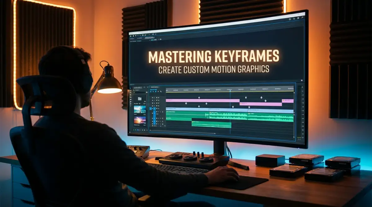
The Frustrating Reality of Stiff, Boring Videos
90% of beginner videos get skipped in the first five seconds simply because of static, lifeless text. You spend hours editing, but your titles still look like a cheap 2005 PowerPoint presentation. The good news? The secret to getting that buttery-smooth, professional look does not require a film degree or fancy third-party plugins. Your editing software already has the tools built right into it. Today, I am going to show you exactly how to fix your robotic graphics using a few simple tweaks, transforming your boring text into high-retention cinematic animations.
⚡ Quick Action Guide: What You Will Learn Today
- How to use keyframes to move any object on your screen.
- The simple "Easing" trick to instantly fix stiff, robotic text.
- Why your Anchor Point is breaking your graphics (and how to fix it).
- How adding sound effects literally tricks the brain into seeing better motion.
- The danger of over-animating and why simple contrast matters most.
Demystifying the Magic of Timeline Animation
To fix this problem, we need to completely change how we think about moving objects on a screen. You do not need to be a math genius or a professional animator to understand this concept. The entire secret to making things move relies on one simple tool called a keyframe.
Think of a keyframe as a tiny digital pushpin on a map. When you want to travel from your house to the grocery store, you need a starting point and an ending point. In the video editing world, these two points tell the software exactly where your text or graphic should be at specific times.
If you place a keyframe at the start of your timeline, you lock your text in that exact position. If you move forward two seconds and place another keyframe, you lock the text in a new position. The software then magically fills in the gap, moving the text from point A to point B for you.
My personal realization here: I used to think I had to animate every single frame by hand, which sounded like pure torture. The day I realized the software does all the heavy lifting between the two points, my entire editing workflow became incredibly fast and actually fun.
The Science Behind How Our Eyes Track Motion
You might be wondering why your keyframes still look weird even when you set them up correctly. The answer lies in how the human brain naturally processes movement in the real world. In nature, absolutely nothing moves at a constant, robotic speed from start to finish.
When you throw a baseball, it accelerates quickly from your hand and then slows down as gravity takes over. Our eyes are scientifically trained to expect this natural change in speed. When an object on your screen moves at a perfectly flat, unchanging speed, our brains instantly recognize it as fake and cheap.
According to basic physics and human perception, we crave momentum and friction. If your text slides onto the screen and stops instantly without slowing down first, it causes a tiny visual shock to the viewer. This is exactly why your current edits might be feeling heavy, stiff, or amateurish.
Introducing Natural Easing to Your Graphics
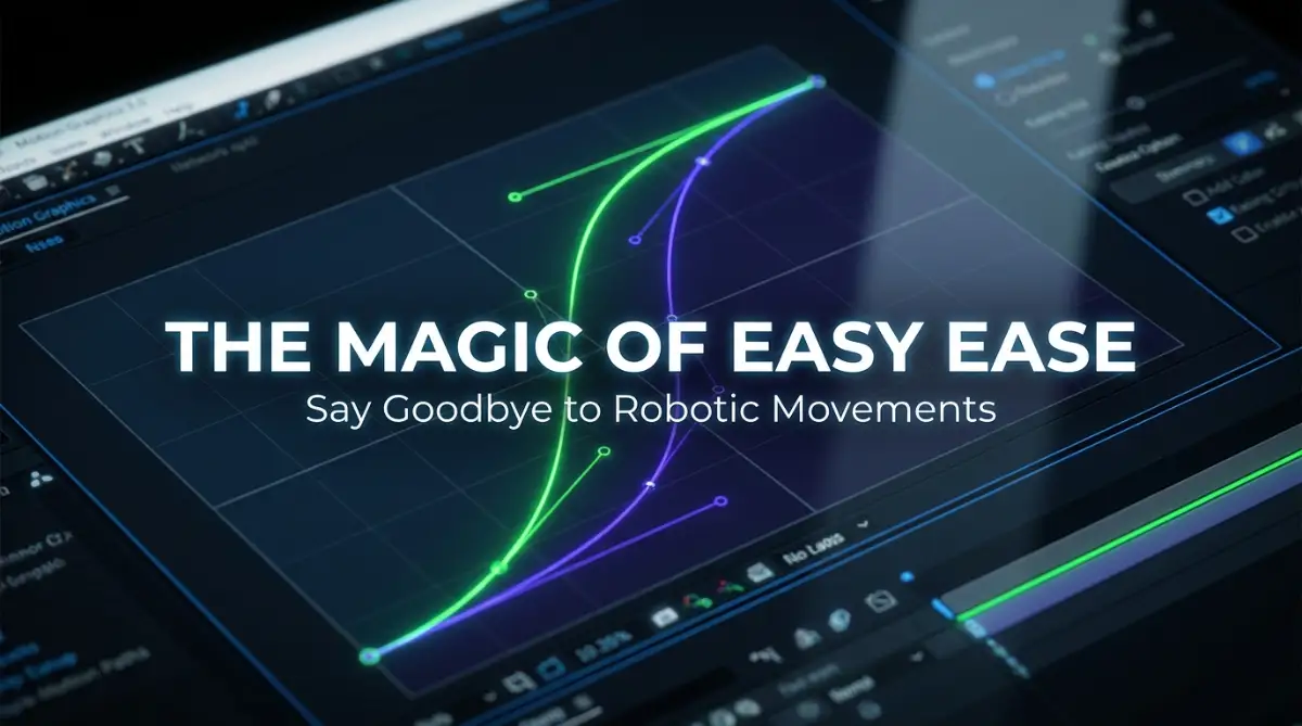
To fix this visual shock, we use a technique called "easing" to smooth out the movement. Easing simply tells your editing software to slowly build up speed at the beginning and gently slow down at the end. Almost every modern video editor has a button for this, often called "Easy Ease" or "Smooth Curve".
When you highlight your keyframes and apply this easing effect, the change is instantly noticeable. Your stiff text suddenly glides into place like a luxury car rolling up to a stop sign. This single click is the biggest difference between a beginner's video and a professional broadcast.
Linear Motion vs. Natural Easing: What is the Difference?
Bold Video Intro: If you want to see exactly how these speed curves change the feeling of a graphic in real-time, watch this incredibly helpful visual breakdown below that simplifies the whole process.
How to Master the Speed Graph
Once you get comfortable with basic easing, you will notice a tool called the graph editor. I know this screen looks like a terrifying heart monitor at a hospital, but you should not be afraid of it. The graph editor is simply a visual representation of how fast your text is moving.
Instead of just clicking a default button, you can grab the handles on this graph to create custom speeds. You can make your text whip onto the screen incredibly fast and then slowly float into its final position. This creates a highly dynamic, snappy feeling that keeps viewers totally engaged.
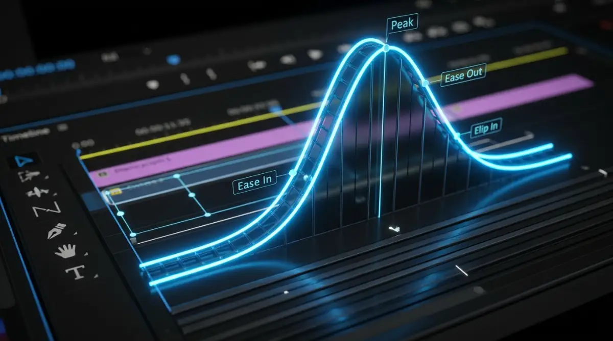
By pulling the curve handles sharply to the left, you tell the graphic to do all its moving at the very beginning. This aggressive curve is highly popular in modern social media content because it grabs attention instantly. Playing around with these curves is where your personal editing style actually begins to develop.
Animating More Than Just Position
Most beginners only use keyframes to move things up, down, left, or right. However, you can use these little diamond icons to animate literally any property in your software. You can animate the size, the rotation, and even the transparency of your text.
Imagine you want a subscribe button to appear on the screen. Instead of just sliding it up, you can start its scale at zero percent and end it at one hundred percent. This makes the button "pop" into existence, which is visually much more satisfying than a simple slide.
You can even combine these properties for a much richer effect. You can make a word scale up while simultaneously fading in from complete transparency. Layering these simple animations together creates complex, custom motion graphics that look like they took hours to build.
The Importance of the Hidden Anchor Point
There is a massive trap that destroys a lot of custom graphics, and it involves something called the anchor point. The anchor point is a tiny target icon that tells the software where the true center of your object is located. Every single animation revolves around this specific little dot.
Think of a door in your house. The door swings smoothly because the hinges are attached to the edge. If you moved the hinges to the direct center of the door, it would spin around like a weird revolving gate. Your digital graphics behave in the exact same way based on where you place that anchor point.
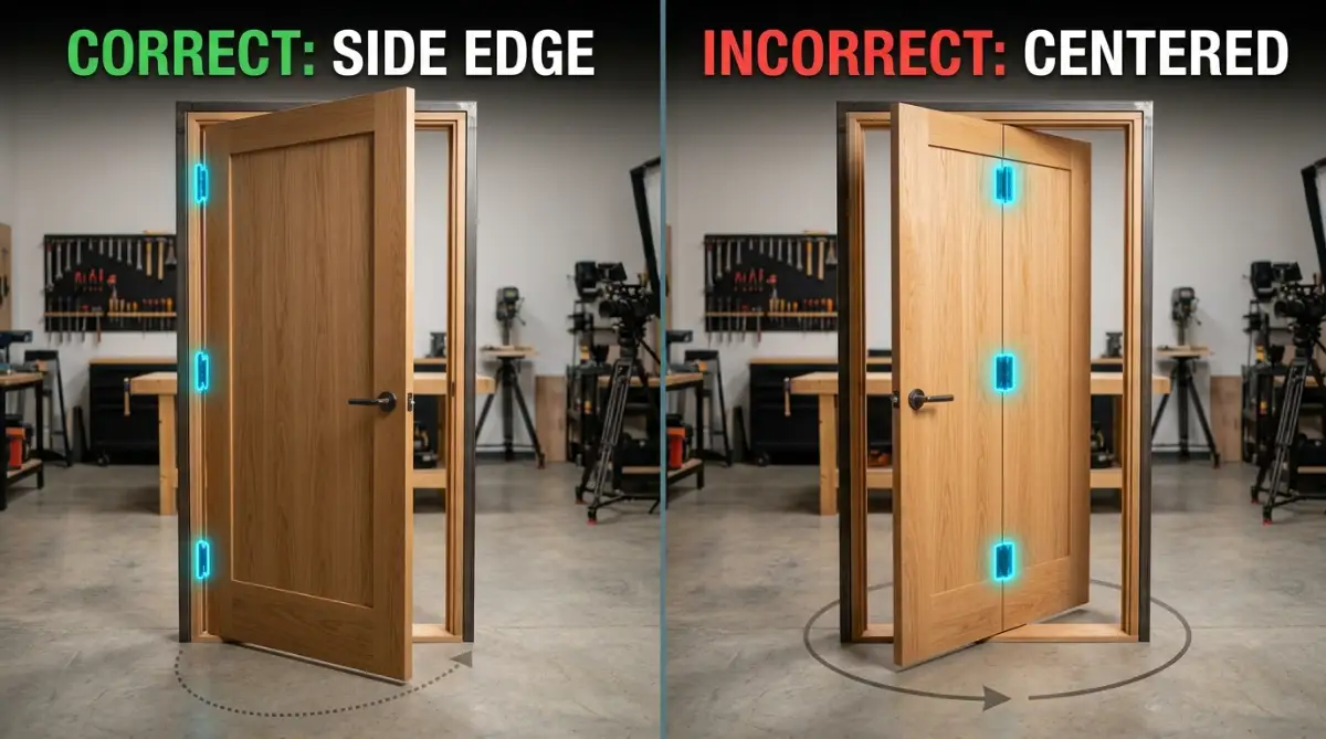
If you try to scale up a piece of text, but the anchor point is way off in the corner, the text will grow sideways instead of popping up nicely from the center. Always make sure to center your anchor point on your text before you add your very first keyframe. This tiny habit will save you hours of frustrated troubleshooting later.
Building Visual Interest with Masks
Once you have mastered moving text around, you can introduce masks to create mind-blowing reveal effects. A mask is essentially an invisible box that hides parts of your video or graphic. You only see the text when it moves inside the boundaries of this invisible box.
You can place a mask right in the middle of the screen and animate your text to slide up from underneath it. To the viewer, it looks like the words are magically rising out of a hidden hole in the ground. This creates a very clean, modern aesthetic used by top corporate brands and popular vloggers.
Using masks prevents your text from awkwardly flying across the entire screen and cluttering up the video. It keeps the motion contained and intentional, which makes your entire project feel much more organized. The best part is that creating a mask usually just takes one single click in your editing panel.
Creating Reusable Motion Templates
Animating everything from scratch for every single video is a massive waste of your time. Once you spend ten minutes creating a beautifully eased, perfectly masked title drop, you need to save it. Most software allows you to highlight your finished keyframes and save them as a custom preset.
Over time, you will start to build a personal library of your favorite slides, pops, and fades. When you edit your next video, you just drag and drop these saved presets onto your new text layers. This completely removes the anxiety of animation because the hard work is already securely saved on your hard drive.
You can even create specific graphics like lower thirds, which are the little name tags that pop up at the bottom of documentary interviews. By saving a cleanly animated lower third, you guarantee that your personal brand looks highly consistent across your entire channel. Consistency builds trust, and trust builds a loyal audience.
Overcoming the Fear of the Timeline
Start by keeping things incredibly simple. Add two position keyframes, highlight them, and apply the easy ease curve. Watch how the natural motion instantly improves the feeling of your video, and let that small victory fuel your confidence to try bigger effects.
💡 Editor's Pro-Tip: The Power of the Undo Button
Do not let the fear of breaking your project hold you back. The editing timeline is your safe playground, not a strict test that you can fail. I mess up my keyframes all the time! If an animation looks crazy, just highlight the little diamond icons, hit your delete key, and try again. You cannot permanently break anything.
Pro-Level Secrets for Cinematic Motion and Timing
Now that you understand the basic concept of easing and speed curves, it is time to push your skills into professional territory. Creating amazing visual effects is not just about making things move from side to side. It is about making your graphics feel totally alive and deeply connected to the rest of your video.
When you master these advanced techniques, your audience will naturally assume you hired an entire production team. You will start to see better audience retention because your videos will physically feel better to watch. Let us explore exactly how the top industry professionals create that high-end, expensive look.
Syncing Your Movement to Audio Beats
One of the biggest secrets in the editing world is that good animation is heavily dependent on sound. If your text slides across the screen in total silence, it feels weird and disconnected. Our brains expect to hear a physical noise when something moves quickly.
Whenever you add a fast-moving graphic to your project, you must add a matching sound effect. A simple "whoosh" or "swish" sound completely tricks the brain into believing the digital object has real physical weight. According to research on auditory-visual perception published by the National Institutes of Health, perfectly synced audio can actually make a viewer perceive a movement as smoother than it really is.
🚨 Myth vs. Fact: Audio Syncing in Editing
- The Myth: Viewers only care about how clean your graphics look. Sound is just an extra bonus.
- The Fact: Bad audio completely breaks the illusion of movement. A fast text slide without a "whoosh" sound makes the graphic feel paper-thin. When you pair heavy text with a heavy "thud" sound, you trick the human brain into feeling real physical weight on a digital screen.
You should also practice timing your keyframes to hit exactly on the heavy beats of your background music. If the bass drops at exactly two seconds, your main title should slam onto the screen at that exact same millisecond. This creates a deeply satisfying rhythm that keeps your audience fully engaged with your message.
Mastering the Illusion of Motion Blur
Have you ever paused a high-action sports video and noticed that the athlete's fast-moving arm looks completely blurry? This happens because real-world cameras and human eyes cannot perfectly capture high-speed motion without a little bit of smearing. Digital text, however, is naturally generated with perfectly sharp edges, which makes it look fake when moving fast.
To fix this, you need to manually turn on the motion blur setting for your animated layers. When your graphic whips across the screen quickly, the software will intentionally blur the edges in the direction of the movement. As the graphic slows down and comes to a stop, the text will gradually become perfectly sharp again.
This tiny little detail makes a massive difference in how professional your project feels. It softens the harsh digital feeling and makes the whole experience much easier on the eyes. Understanding these small physical details is just like decoding the science behind generative AI prompts; knowing why things work helps you create much better art.
The Power of Parenting and Null Objects
As you get more confident, you might want to animate three or four different words at the exact same time. Animating every single word individually would take hours and create a very messy timeline. This is where a brilliant feature called "parenting" saves the day entirely.
Parenting allows you to link several different graphics to one single invisible controller, often called a "Null Object". You simply tell the software that the separate text layers should follow everything the invisible controller does. When you add keyframes to the single controller, all the linked graphics move together perfectly as a team.
This technique is highly important for building complex title cards or animated logos. Leading animation instructors at School of Motion always emphasize layer organization as a foundational skill for serious editors. By controlling multiple layers with one single point, you save an incredible amount of time and mental energy.
Building a Long-Term Reusable Asset Library
If you want to maintain this high quality over a long period of time, you have to work smart, not just hard. The biggest mistake you can make is starting completely from scratch every single time you open your editing software. You need to build a personal library of your best work.
Whenever you create a perfectly smooth, beautifully timed title animation, highlight those keyframes and save them as a custom preset. Give it a clear name like "Fast Slide In With Blur" so you know exactly what it does. The next time you edit a video, you can just drag and drop this preset onto any new piece of text in seconds.
By building this library, you are essentially creating your own custom software plugins. This allows you to edit videos incredibly fast while still keeping that expensive, professional look. You can also explore our digital resources homepage to find more tools that streamline your daily creative workflow.
Establishing a Consistent Brand Style
When you have a strong library of animations, your videos start to develop a unique personal style. Your viewers will begin to recognize your content within the first three seconds just based on how your graphics move. This kind of brand recognition is incredibly valuable for growing an online audience.
You should pick two or three specific animation styles and use them consistently across all your videos. If your channel is highly energetic, stick to fast, snappy movements with aggressive speed curves. If your content is educational and calm, use slow, gentle fading animations that feel relaxing.
Maintaining this exact visual style is very similar to the challenge of mastering AI character consistency across different images. You want your audience to feel a sense of familiarity every single time they click on your content. A consistent style builds deep trust with your community over time.
The "Everything Everywhere All At Once" Syndrome
When you first discover how fun it is to animate, the natural temptation is to make absolutely everything move. You might have your background spinning, your logo bouncing, and your main text flying in 3D space all at once. This creates an overwhelming amount of visual chaos on the screen.
Instead of looking cool and advanced, your video will just look like a messy early 2000s web advertisement. The human eye can only focus on one main moving object at a time before feeling totally overwhelmed. Top usability experts at the Nielsen Norman Group specifically warn against excessive web animation because it distracts from the actual message.
Your motion graphics should always guide the viewer's eye exactly where you want it to go. If every single element is fighting for attention, the viewer will just get a headache and leave. Often, a very simple, elegant slide-in effect is much more powerful than a wildly complicated 3D spin.
Ignoring the Human Reading Speed
This is perhaps the most frustrating mistake you can make when adding text to your videos. You might spend hours making a paragraph of text slide beautifully onto the screen, only to have it disappear a second later. You get so caught up in the technical movement that you forget people actually need to read the words.
If your audience has to pause the video just to read your graphics, you have completely failed as an editor. Fast-disappearing text makes people feel anxious and annoyed, which ruins the entire vibe of your video. A great rule of thumb is to read your on-screen text out loud two full times before you allow it to animate away.
Clarity should always be your number one priority, no matter how fancy your effects get. If your text is too fast or hard to read, it is exactly like having a great picture ruined because your AI images look completely blurry. Never sacrifice the basic readability of your content just to show off a cool editing trick.
The Anchor Point Disaster
I cannot tell you how many times this specific technical error completely destroyed my early video projects. As we discussed earlier, the anchor point is the tiny target that tells the software where the center of your graphic is. If you forget to place this point correctly before you start animating, you are in for a terrible time.
Imagine you want a word to slowly grow larger in the middle of the screen. If your anchor point is accidentally placed way off in the bottom left corner, the text will aggressively grow diagonally instead of popping out evenly. Your graphic will swing across the screen wildly, and fixing it later is a massive headache.
Always, always double-check your anchor point placement before you drop a single keyframe onto your timeline. This structural foundation is just as important as knowing how to properly fix deformed hands and faces in AI art before finalizing an image. Build a solid base first, and the rest of the movement will behave exactly as you expect.
✅ Your 3-Second Pre-Animation Checklist
- Is my anchor point perfectly centered on the text?
- Do I have enough visual contrast between the text and the video background?
- Have I turned on the motion blur switch for this layer?
Failing to Create Visual Contrast
You can create the absolute smoothest, most mathematically perfect motion curve in the world, but it will not matter if nobody can see it. Placing thin, bright text over a brightly lit video background is a guaranteed recipe for failure. Your custom animations absolutely need visual contrast to pop off the screen.
Many creators spend hours refining their timing graphs but completely ignore how their colors interact with the video underneath. It is very similar to the frustration of ruining beautiful AI art with terrible lighting mistakes. Bad contrast completely hides all the hard work you put into your design.
To solve this, simply add a soft black drop shadow behind your animated text to lift it off the background. You can also blur the underlying video slightly when your text pops up to force the viewer's eye onto your words. Professional motion designers always make sure their animations are the clearest, most visible elements on the screen.
Your Action Plan for Beautifully Animated Videos
You do not need to memorize every single shortcut overnight. The best way to learn is to take these simple concepts and apply them to your current project today.
The Daily Practice Routine
Your goal for this week is incredibly simple and highly focused. Open up an old project that you have already finished and find one piece of static text. Try adding just two simple keyframes to make that text slide gently into the center of the frame.
Once you have that basic movement, open up your easing options and smooth out the beginning and the end. Add a tiny bit of motion blur and a nice "swoosh" sound effect right when the text moves. Watch how that single graphic instantly transforms the entire energy of the scene.
Celebrate these small, daily victories because they quickly stack up into a massive professional skill set. Keep saving your favorite movements as presets, keep pushing your creative boundaries, and trust the process. You are now fully equipped to make your videos look absolutely spectacular!
My Personal Takeaway: When I finally stopped fighting the software and started understanding how natural motion actually works, my entire career completely changed. I went from dreading the editing process to actually smiling while watching my graphics glide perfectly across the screen. I highly encourage you to open your software today, play around with those speed curves, and watch your creative confidence absolutely skyrocket!
Common Questions About Custom Graphics and Animation
Can I learn keyframing if I am terrible at math?
Yes, absolutely! You do not need to know any complex math or coding to make beautiful motion graphics today. The software handles all the complicated calculations behind the scenes for you. You just need to rely on your eyes and adjust the speed until the movement feels natural and smooth.
How long does it realistically take to get good at this?
If you practice for just twenty minutes a day, you will understand the basics of easing and timing within a single week. The interface might look scary at first, but the actual process is incredibly repetitive and easy to learn. Once you build your preset library, animating a new video will only take you a few minutes.
Why does my text animation look jittery after I export the video?
This usually happens because your sequence frame rate does not match the original footage you recorded. It can also happen if you completely forgot to turn on the motion blur switch for your moving layers. Always double-check your export settings to make sure you are rendering at a smooth twenty-four or thirty frames per second.
Should I buy expensive plugins to animate my text?
No, you do not need to spend any extra money when you are just starting out. Almost every single effect you see on popular social media videos can be built using the free, built-in tools inside your editing software. Once you master the manual graph editor, you will realize that expensive plugins are mostly unnecessary.
Is it better to animate text quickly or slowly?
It entirely depends on the specific mood and energy of your video content. High-energy gaming videos or fast-paced tutorials benefit from very quick, snappy animations that grab attention instantly. If you are editing a calm, emotional documentary, slow and gentle fading movements are much more appropriate for the viewer.
Disclaimer: The information provided in this blog post is for educational and informational purposes only. The tips, strategies, and software techniques discussed reflect personal experiences and standard industry practices, but individual results may vary depending on your specific hardware and software versions. We do not guarantee any specific financial success, channel growth, or viewership outcomes from applying these methods. Always ensure you are following the terms of service and community guidelines of any platforms where you publish your content.