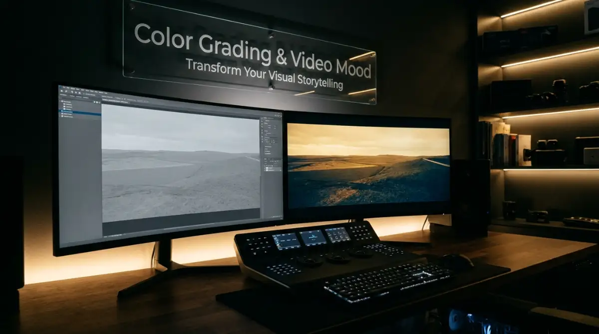
The Frustrating Reality of Flat and Lifeless Footage
Let's be real—nothing hurts more than shooting a video that looks amazing in person, only to find out it looks like a gray, muddy mess on your computer screen. You hit play, expecting movie magic, but instead, you get a cheap home video vibe. I used to think my camera was the problem. Turns out, it wasn't my gear at all. I just didn't know how to paint with color, and my footage was begging for a little bit of life.
Then, I stumbled upon a simple editing technique that completely changed my life. I realized my footage was not ruined at all; it just needed the right emotional paint. That was my very first introduction to the magical world of adjusting colors to tell a story.
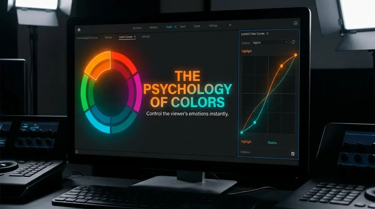
Before You Edit, Remember This:
- Fix it before you style it: Always balance your exposure and fix your white balance before adding fun colors.
- Emotions equal color: Use warm tones (orange/yellow) for happy, nostalgic feelings, and cool tones (blue/gray) for tense, sad moments.
- Waveforms never lie: Don't trust your bare eyes in a dark room; let the software graphs tell you if your video is too bright or too dark.
- LUTs are not magic buttons: A preset filter will not magically fix bad lighting. You still have to put in the effort to tweak the colors manually.
Fixing the Foundation: Color Correction vs Cinematic Styling
Many beginners open their editing software and immediately start slapping heavy filters on their clips. This is a massive mistake that ruins the quality of the image.
Before we can start painting beautiful emotions, we have to prepare our canvas properly. This process is called color correction, and it is entirely different from grading.
Correction is all about making the video look natural and accurate to real life. When a camera records a scene, it often gets the white balance or the exposure slightly wrong.
Maybe the white wall in your bedroom looks a bit yellow, or the bright sky looks completely blown out. Color correction simply fixes these tiny errors so everything looks normal.
Think of it like taking a shower and brushing your teeth before putting on a nice suit. You cannot skip the basic hygiene step if you want to look good later.
The Big Mix-Up: Correction vs. Grading
People mix these two up all the time. Here is the easiest way to remember how they actually work together:
Once your footage looks perfectly balanced, you are finally ready to start controlling the feelings of your audience. This is where the true artistic process begins.
A Complete Guide to Setting the Right Mood for Your Story
The Secret Language of Warm and Cool Tones
Human beings are wired to react to colors on a deep emotional level. We do not even realize it is happening, but our brains instantly process visual signals.
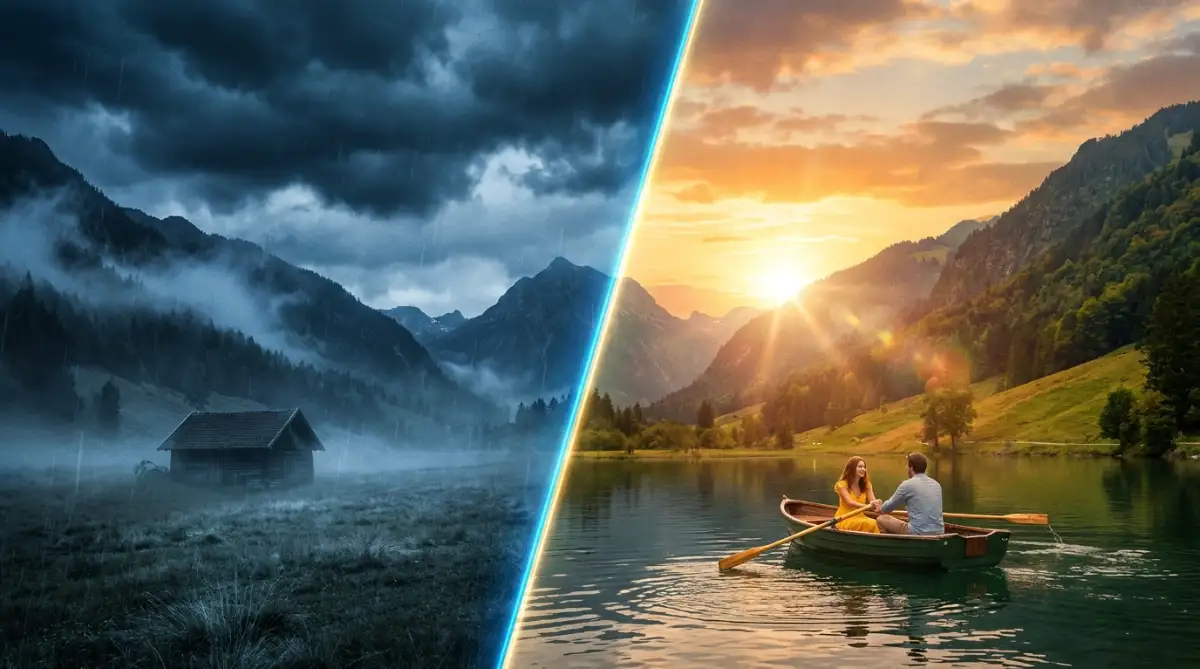
When you use warm colors like orange, red, and yellow, you trigger feelings of comfort, nostalgia, and happiness. Think about your favorite romantic comedy movies.
Almost all of them use golden hour lighting and warm skin tones to make you feel safe and relaxed. If you are editing a travel vlog about a sunny beach, pushing your highlights toward a warm yellow will make your audience feel the heat of the sun.
On the other hand, cool colors like blue, teal, and gray create a completely opposite reaction. These tones make us feel isolated, cold, or highly suspicious.
If you watch a modern horror movie or a thrilling mystery, you will notice the shadows are almost always tinted blue. This cool tone physically makes the viewer feel uncomfortable and on edge.
If you want to make a dramatic short film about a sad breakup, cooling down the temperature of your entire video is the easiest way to make the audience feel that sadness. The software tools you use allow you to push these tones directly into the highlights or shadows of your image.
By separating the bright parts of the video from the dark parts, you build incredible visual depth.
Mastering the Art of Teal and Orange
If you spend any time watching big-budget action movies, you have probably noticed a very specific color combination. It is called the teal and orange look, and it is the most popular style in the modern entertainment industry.
There is a very logical and scientific reason why video editors love this specific combination so much. If you look at a basic color wheel, orange and blue sit exactly opposite from each other.
Because they are opposite, placing them next to each other creates maximum visual contrast. Human skin naturally falls into the orange section of the color wheel, regardless of a person's actual race or background.
Quick Pro Tip: Don't turn people into pumpkins!
When you push teal into your background shadows, your editing software naturally pushes orange into the highlights. If you go too far, your actors will literally look like glowing orange pumpkins.
My golden rule? Push the teal slider just enough so the background looks cool, then immediately check the faces in the shot. If the skin looks like a bad spray tan, dial the whole effect back by at least 20%.
So, by pushing the dark shadows of your background into a rich teal color, the orange skin tones of your actors will pop out off the screen. This instantly draws the eye of your viewer exactly where you want it to go.
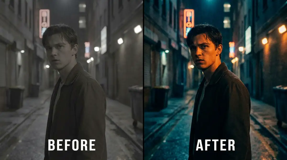
Here is a quick realization from my own editing journey. I used to push the teal slider way too hard in my shadows, making my subjects look like they were drowning in a blue swimming pool. I finally learned that subtlety is everything; you only need a tiny push on the color wheels to make the skin tones pop beautifully without making the scene look fake.
Using this high-contrast method makes your videos look incredibly professional and expensive. You do not need a fancy camera to achieve this; you just need to understand how complementary colors work inside your editing software.
Why Saturation Dictates the Energy of Your Scene
Besides shifting the actual colors around, you also have total control over how strong those colors appear. This is known as saturation, and it plays a massive role in setting the energy level of your project.
High saturation means the colors are extremely bright, loud, and punchy. You will often see this style in children's television shows, high-energy music videos, or fast food commercials.
Bright, saturated colors tell the brain that everything is exciting, fun, and moving quickly. If you are creating a cooking video for YouTube, pumping up the saturation makes the red tomatoes and green vegetables look incredibly delicious.
However, lowering the saturation creates a completely different psychological effect. When colors are muted and closer to gray, the brain interprets the scene as serious, gritty, or historically old.
Many war movies or intense dramas remove a large amount of color from the picture to match the heavy subject matter. Lowering the saturation forces the audience to focus on the story and the acting rather than bright, distracting elements.
If you are filming a documentary about a serious topic, keeping your colors somewhat muted will instantly add respect and gravity to your interviews.
The Illusion of Time and Memory
One of the most powerful things you can do with your software tools is manipulate the audience's perception of time. You can easily jump backward or forward in history just by changing the way your image looks.
When directors want to show a flashback or a memory, they rarely rely on text on the screen. Instead, they shift the color palette to tell the viewer that we are in the past.
A very common technique is to make the footage look slightly sepia, which is a soft, faded brown tone. This mimics the look of very old printed photographs from the early twentieth century.
Another popular method for showing memories is to make the colors extremely dreamy and soft, lowering the contrast so the blacks are no longer deep. This represents how human memories are often hazy and not perfectly clear.
On the flip side, if a story takes place in the distant future, editors will often use very sharp contrast with strong neon blues and greens. This gives the video a highly sterile, technological feeling.
Think about the way science fiction movies make heavy use of green tints to make everything feel slightly alien or computer-generated. By simply adjusting your color wheels, you take your audience on a journey through different time periods without ever saying a single word.
How Lighting Interacts with Your Software Adjustments
A massive misconception among beginners is that software can fix absolutely anything you shoot. While editing programs are incredibly powerful today, they still rely on the actual light captured by your lens.
If you shoot a video in completely flat lighting with no shadows, no amount of editing will make it look cinematic. Editing tools need different levels of brightness to hold onto different colors effectively.
When you have a dark shadow on one side of a face and a bright highlight on the other side, the software can easily separate them. You can push a cool blue into that dark shadow and a warm orange into that bright highlight.
But if the face is just one solid block of brightness, the colors will mix together and turn into a messy gray mud. This is why understanding basic lighting on set makes your job in the editing room a thousand times easier.
Always try to create some natural contrast when you are filming. Turn off the big ugly ceiling lights and use a single lamp from the side of the room.
Once you bring that highly contrasted footage into your computer, the color tools will react beautifully to every single adjustment you make.
Creating Consistency Across Different Clips
One of the hardest challenges a video editor faces is making sure every single clip looks like it belongs in the exact same movie. You might shoot one scene outside in the cloudy afternoon and another scene inside a bright yellow kitchen.
If you place these two clips next to each other on your timeline, the sudden jump in color will completely shock the viewer. It breaks the illusion of the story and reminds them they are just watching a video on a screen.
This is where shot matching becomes incredibly important. You have to use your software scopes and tools to balance the clips so they feel connected.
First, you pick one clip that represents the exact mood you want for the entire video. We call this your hero shot.
Then, you go to all the other clips and adjust their temperature and brightness to match that hero shot perfectly. Your viewers should never notice the cuts between different locations.
The entire visual experience should flow smoothly like one continuous painting. Learning how to match shots properly is what separates a beginner who just throws filters on things from a true professional editor who crafts a beautiful story.
Understanding When to Break the Rules
While there is a lot of science and psychology behind adjusting colors, it is still an art form at the end of the day. Once you learn how to balance your image and use basic complementary colors, you can start experimenting.
Sometimes, doing the exact opposite of what the audience expects can create a fascinating viewing experience. Imagine creating a terrifying horror short film, but instead of dark blue shadows, you make everything incredibly bright, sunny, and saturated.
The contrast between the happy visual mood and the scary events happening on screen will make the viewer deeply uncomfortable in a very unique way. Do not be afraid to grab your color curves and pull them in weird directions just to see what happens.
Some of the most iconic visual styles in movie history happened because an editor simply made a mistake or decided to break traditional rules. Your software is a safe playground where you can easily hit the undo button if things look terrible.
Keep testing out different looks until you find a specific visual signature that feels like your own personal style. That is the true joy of adjusting the mood of your videos.
Steal These Professional Color Grading Secrets for Your Next Video
Once you understand the basic psychology of warm and cool tones, you can start using the exact same tricks that Hollywood editors use every single day. One of the biggest secrets I learned early on is that you should never trust your own human eyes.
Our eyes are incredible, but they easily trick our brains depending on our environment. If you edit your video in a dark room late at night, a bright clip might look absolutely perfect to you.
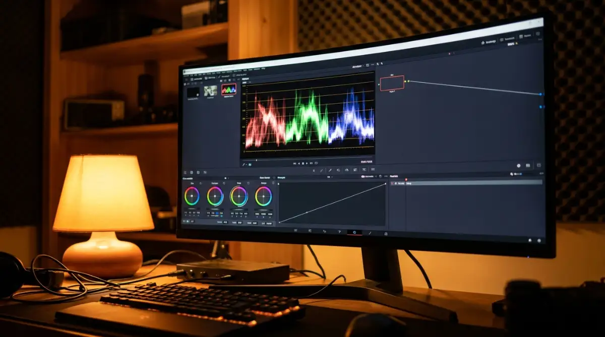
But when you watch that same video on your phone sitting in the bright morning sun, it will suddenly look incredibly dark and muddy. This is exactly why professional editors rely heavily on software tools called scopes instead of just looking at the monitor.
A waveform monitor is a special graph inside your editing software that shows you exactly how bright or dark your image actually is. It measures the pure data of the video file, and data does not lie to you.
By reading a waveform, you can guarantee that your bright skies are not completely blinding the viewer and your dark shadows are not crushing all the beautiful details. Learning to read these simple graphs completely changed the way I approach my projects.
Another highly guarded secret in the industry is understanding how different light sources mix inside your camera. Many beginners shoot their videos standing near a window with blue daylight, while keeping a warm orange bedroom lamp turned on behind them.
This creates a messy, mixed lighting situation that confuses the editing software and makes the footage almost impossible to fix. If you want a smooth editing process, you must avoid bad lighting setups that ruin your visual canvas before you even hit the record button.
The Hidden Power of Color Isolation
One of the most powerful things you can do inside modern software is isolate a single color and change it without affecting the rest of the image. Imagine you have a beautiful shot of a person wearing a bright red jacket, but the green grass behind them looks a bit dead and brown.
You do not need to change the entire temperature of the video to fix the grass. Instead, you can use a tool called an HSL Qualifier (Hue, Saturation, and Luminance) to select only the dead grass.
Once you isolate that specific brown area, you can easily shift it toward a rich, healthy green. The red jacket and the person's skin tone will stay exactly the same, making the final result look like absolute magic.
This technique requires a little bit of patience, but it completely separates amateur videos from highly professional visual stories. To deeply understand how software manipulates these pixels, exploring the science behind digital image generation can give you a massive advantage over other creators.
Understanding the True Purpose of Film Grain
A lot of modern digital cameras shoot footage that looks almost too perfect and incredibly sharp. While high resolution is great, sometimes an overly clean image feels fake and heavily computerized to the human brain.
To bring back a sense of natural realism and nostalgia, professional editors often add a tiny layer of digital film grain over their entire project. This grain gently blends all the colors together and softens the harsh digital edges.
It tricks the viewer into feeling like they are watching an authentic, vintage piece of art shot on real 35mm film. The American Society of Cinematographers (ASC) often discusses how subtle texture heavily influences an audience's emotional connection to a visual story.
However, you have to be extremely careful with how much grain you apply. If you push the effect too hard, your video will just look messy and low-quality.
The Heartbreaking Mistakes That Instantly Ruin Beautiful Footage
Watching someone destroy a perfectly good video clip with terrible editing choices actually breaks my heart. I have made all of these mistakes myself, and I want to save you from that painful embarrassment.
One of the most dangerous traps for new video creators is the blind use of Look Up Tables, commonly known as LUTs. A LUT is basically a mathematical preset filter that automatically changes the colors of your video with a single click.
Many popular YouTubers sell their own custom LUT packs, promising that your videos will instantly look like cinematic masterpieces. This is a massive lie that sets beginners up for complete failure.
A preset filter was created for one specific camera, shot in one specific lighting condition, on one specific day. If you drop that exact same filter onto a clip shot in a completely different environment, the colors will break and look absolutely horrendous.
You will often see beginners applying heavy cinematic LUTs without doing any basic color correction first. This lazy habit is exactly why digital images often look degraded, blurry, or artificially broken when exported.
The Oompa Loompa Skin Tone Disaster
Another terrifying mistake I constantly see is pushing the overall saturation way too high, especially when there are human beings in the shot. When you artificially boost the orange and red tones in your video, human skin starts to look heavily sunburned or completely fake.
We call this the 'Oompa Loompa' effect, and it instantly tells your audience that you do not know what you are doing. The human eye is incredibly sensitive to the color of skin because we look at people every single day.
If a sky looks a little too blue, the audience might forgive you, but if a face looks neon orange, they will immediately click away from your video. When practicing different artistic styles and visual mimicry, you must always protect the natural tones of your human subjects above everything else.
According to massive studies on human color perception and visual psychology, viewers physically reject media where facial tones appear unnatural or diseased.
Destroying the Natural Contrast
Sometimes, an editor will try to create a moody, cinematic look by lifting the dark black shadows until they turn into a milky gray. While this faded matte look is popular in certain photography styles, it often ruins the depth of a moving video.
When you remove true black from your image, the entire scene looks flat, washed out, and heavily compressed. Your footage loses its 3D quality and simply looks like it has a dirty fog covering the lens.
You must always make sure your darkest shadows actually touch the bottom of your waveform monitor. This gives the image a solid foundation and makes the brighter colors pop out beautifully against the darkness.
Never sacrifice your basic contrast just to chase a trendy visual aesthetic that might go out of style next year.
Your Personal Blueprint for Emotional Visual Storytelling
Changing the mood of your videos is not a magical talent you are born with; it is simply a language that you learn step by step. You now have a deep understanding of why certain tones make us feel happy, sad, or terrified.
The next step is to actually open your software and start practicing these concepts on your own footage. Do not feel pressured to create a Hollywood masterpiece on your very first try.
Start small by practicing basic color correction on single clips until you can easily balance the whites and the darks. Once your foundation is solid, you can start playing with the color wheels to push warm highlights and cool shadows.
A great habit is to pause your favorite movies and take screenshots of the scenes that make you feel strong emotions. Bring those screenshots into your editing program and look at how the professional colorists pushed their scopes.
Building Visual Harmony Across Your Entire Project
As you get better, your main goal will shift from making one clip look good to making the entire video feel like one cohesive story. Maintaining a consistent visual character across multiple scenes is the true mark of a professional creator.
You want your audience to get lost in the story, completely forgetting that they are watching an edited piece of media. This harmony is built through careful shot matching and paying close attention to small details.
You should also think about how your visual tones interact with the physical framing of your shots. Understanding how different aspect ratios completely change the viewing experience will help you pair the right colors with the right screen dimensions.
For example, a wide cinematic frame pairs perfectly with high-contrast, moody colors, while a vertical social media frame often benefits from brighter, highly saturated tones.
Never Stop Experimenting with Your Tools
To ensure your work always looks accurate to what your audience will see, I highly recommend reading up on proper screen calibration standards so your monitor does not lie to you. Editing is an ever-changing art form, and the software tools are getting smarter and easier to use every single day.
You have the exact same color panels on your laptop that award-winning directors use in their massive studios. All that is missing is your willingness to sit down, make a few ugly mistakes, and learn how to fix them.
The journey of becoming a great editor is filled with tiny moments of frustration, followed by massive waves of creative joy. Stay patient, keep your scopes open, and trust the emotional language of the colors you choose.
I honestly used to dread opening my editing software because everything I touched ended up looking muddy and wrong. But the day I finally matched my first beautiful cinematic shot, I felt an unbelievable rush of pride that I still carry with me today. Grab a simple video clip right now, open those color wheels, and show the world the exact emotion you want them to feel!
Quick Editor's Jargon Buster
Before you jump into your software, here are three weird words you will definitely see, explained in plain English:
Common Questions About Changing Your Video Mood
Do I need to buy expensive software to color grade properly?
Not at all! Many amazing professional tools are available completely for free right now, offering the exact same color wheels and scopes used in expensive software. You can easily learn all the foundational skills without spending a single penny.
What is the actual difference between a LUT and true color grading?
A LUT is just a pre-made mathematical filter that forces a specific look onto your clip instantly, often ruining the natural balance. True grading is a manual, step-by-step process where you individually adjust the exposure, shadows, and highlights to match the unique lighting of your specific video.
How long does it usually take to learn this editing skill?
You can learn the basic software buttons and color wheels in just a few hours by watching simple tutorials. However, training your eyes to properly match multiple shots and build a consistent emotional mood usually takes a few months of active practice.
Why does my edited video look totally different when I watch it on my phone?
Every screen in the world is manufactured differently, and most modern smartphones artificially boost brightness and saturation to look flashy in the store. This is why professional editors rely entirely on software scopes instead of trusting their computer monitors.
Can bad lighting be fixed entirely in the editing room?
No, the software cannot magically invent details that your camera never captured in the first place. If a face is completely covered in dark shadows with zero lighting, trying to brighten it later will only result in messy, low-quality digital noise.
Over to You!
I would love to hear about your own editing journey. What is the biggest struggle you face when trying to color correct your footage? Have you accidentally turned someone into an orange pumpkin before? Drop a comment below and let's talk about it!
Disclaimer: This article is strictly for informational and educational purposes only. The editing techniques and software recommendations discussed represent best practices for visual storytelling and do not guarantee specific professional or financial outcomes. Always ensure you are using licensed software and respecting copyright laws when editing media.
THANK YOU