The Frustrating Reality of Getting the Wrong Output
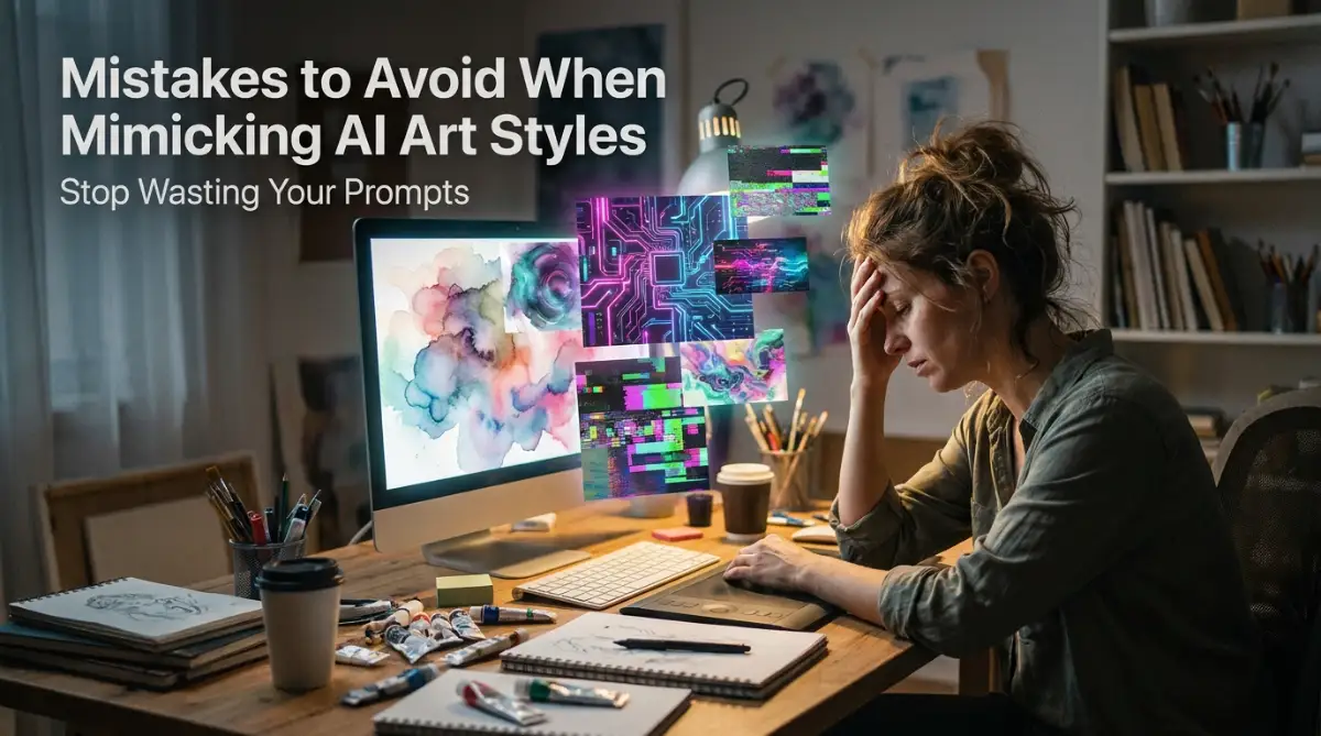
You type your perfect idea into the AI generator, hit enter, and cross your fingers. But instead of the stunning 90s anime aesthetic you wanted, the screen spits out a weird, melted plastic mess. It makes you want to smash your keyboard and cancel your software subscription right then and there. If you are tired of wasting hours guessing the right words to get the art you actually see in your head, let's fix your broken prompts right now.
This daily struggle with AI tools is actively destroying the creative confidence of everyday people. It steals your mental peace when you spend three hours trying to generate one single image. You start questioning your own ability to communicate simple ideas.
But then, I noticed something amazing about how these intelligent systems actually read our text. I realized that my failure was not about my lack of creativity, but rather a few tiny communication errors I was making every single day.
Quick Action Guide: What You Will Learn Today
- Stop the "Prompt Soup": Why writing long, messy paragraphs actually ruins your generated art.
- Master the Medium: How adding words like "cold-pressed paper" or "impasto paint" instantly fixes the fake, plastic AI look.
- Direct the Camera: Using real photography and lighting terms to control the exact mood of your images.
- Lock the Style: A simple trick using seed numbers to keep your favorite characters and styles consistent every single time.
Breaking Down the Hidden Secrets of AI Art Generation
Fixing your prompt mistakes starts with understanding exactly how the machine thinks and processes words. We often treat these tools like human artists who can read our minds and understand our emotions. However, these systems are just highly advanced pattern-matching machines built on massive databases of image text.
When you ask for a specific aesthetic, the system scans its memory for the most common visual rules attached to your words. If your instructions are confusing or mixed up, the machine panics and blends everything together. Let us look at the most practical and scientific ways to fix your styling issues right now.
Stop Dropping Random Artist Names Without Context
One of the biggest errors people make is simply typing a famous artist's name and expecting magic to happen. You might type "a cat in the style of Leonardo da Vinci" and get a really weird, muddy image. The machine knows the name, but it does not know which specific part of the artist's technique you actually want.
Do you want his sketching style, his oil painting technique, or his sepia-toned paper texture? When you leave out these specific details, the system just guesses and usually gets it horribly wrong. You have to give the machine a logical framework to build upon.
Instead of just dropping a name, describe the actual visual elements that make that artist famous. Use descriptive words like "heavy brushstrokes," "dramatic lighting," or "charcoal sketch." This gives the machine a clear roadmap to follow, resulting in much cleaner and more accurate pictures.
Here is a quick cheat sheet showing how I upgrade a lazy prompt into a highly specific one using actual artistic elements:
Think of it like ordering food at a restaurant. If you just tell the chef to "make me a Gordon Ramsay dish," you might get anything from a beef wellington to a simple scrambled egg. You have to specify what exactly you are craving.
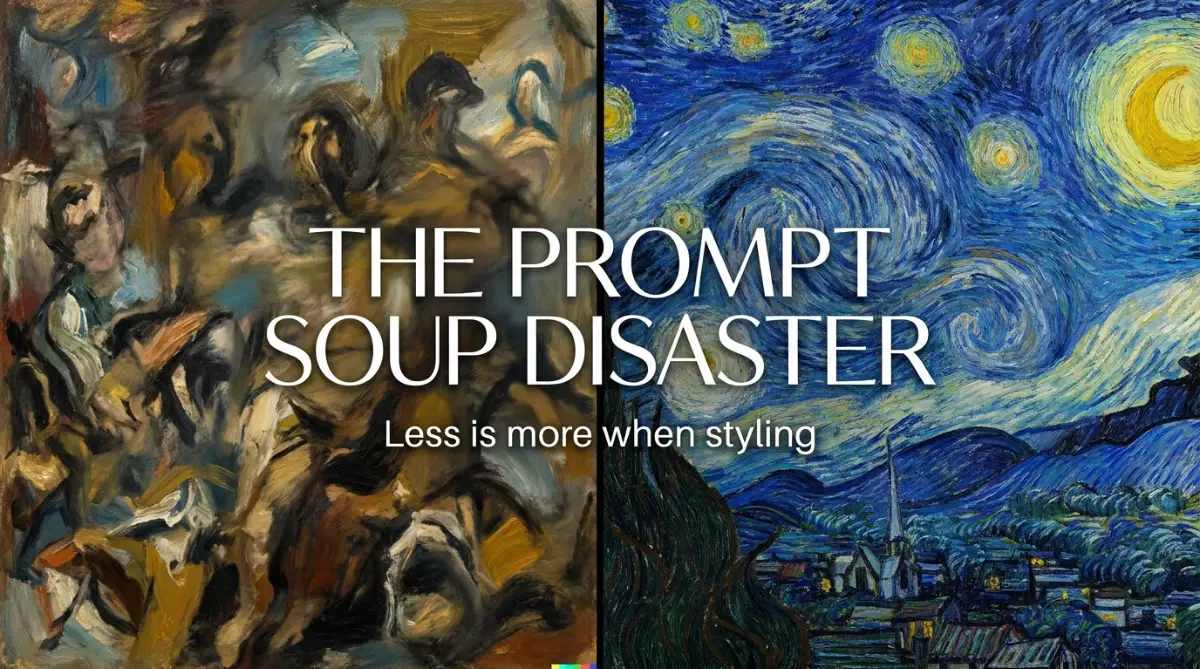
The Complete Danger of "Prompt Soup"
Many beginners believe that adding more words will automatically make their picture look better. They write massive paragraphs filled with words like "masterpiece, 8k, trending on ArtStation, hyper-realistic, beautiful, stunning." We call this messy habit "Prompt Soup," and it actively destroys your desired art style.
When you overload the system with too many conflicting adjectives, the machine loses focus on the actual subject. It tries to blend a hyper-realistic photograph with a painted masterpiece, resulting in a horrible plastic texture. The token limit of the system gets completely overwhelmed by the junk words.
I used to write prompts that were basically long paragraphs of random descriptive words. My biggest realization was that the AI reads your first five words the hardest, so I started putting my main art style right at the very beginning. It completely changed the quality of my output overnight.
Keep your instructions tight, clean, and highly specific to the exact look you want. A short, powerful prompt will almost always beat a long, messy paragraph. Clean communication equals clean styling.
Why You Keep Missing the "Medium" Marker
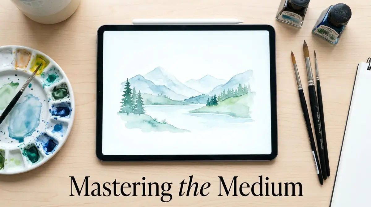
If you want a picture to look like a watercolor painting, you have to explicitly tell the system about the physical medium. Many users describe the colors and the subject perfectly but completely forget to mention the actual materials. The machine defaults to a generic digital art look because it was never told to simulate real paint.
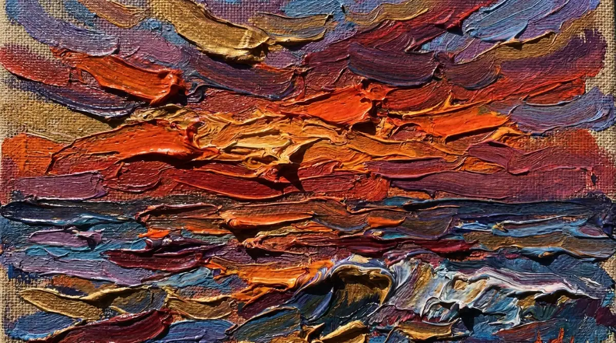
To fix this, you need to study traditional art supplies and use their names in your text. Words like "wet-on-wet watercolor," "thick impasto oil paint," or "faded polaroid film" change the mathematical weights of the image. The system instantly shifts its focus to mimicking those exact physical textures.
This simple addition adds a massive layer of realism and believability to your generated art. You can even mention the type of canvas or paper, like "rough cold-pressed paper," to force the AI to draw the background texture. These tiny physical details are what separate amateur outputs from professional ones.
The Hidden Power of What You Do Not Want
Sometimes, the best way to get a specific style is to tell the machine exactly what to avoid. This is called negative prompting, and it is a massive game-changer for cleaning up your final results. If you are trying to make a flat, 2D vector logo, the AI might naturally try to add realistic 3D shadows because it thinks that looks better.
By simply telling the system to avoid "3D, realistic, shading, gradients," you force it to stay completely flat. You are essentially building a fence around your idea so the machine cannot wander off into the wrong artistic direction. Many people completely ignore this feature, which leads to highly frustrating results.
If you want to instantly fix ugly, distorted, and mixed-up art styles, watching this quick breakdown on negative prompting will change your entire workflow.
Myth vs Reality: The "Resolution" Trap
There is a massive myth floating around online that typing "4k" or "8k" makes your image more detailed or stylized. The reality is that these words often push the AI away from softer, more traditional art styles. If you want a soft, blurry oil painting, typing "8k resolution" will force the machine to add sharp, unnatural details that ruin the painted look.
These resolution keywords are only helpful if you are trying to create highly realistic photography or sharp digital renders. For traditional, vintage, or abstract art styles, these words are your absolute worst enemy. They conflict directly with the messy, human nature of traditional art.
Quick Reality Check: Myth vs Fact
- Myth: Typing "8k, ultra-detailed, hyper-realistic" makes every single AI image look better.
- Fact: If you want a soft, hand-drawn look (like charcoal sketches or old polaroids), those words will actually ruin your picture by forcing the machine to add harsh, fake-looking digital sharpness. Match your words to your medium!
Instead of resolution words, focus heavily on lighting terminology to create depth and mood. Words like "soft studio lighting," "golden hour," or "harsh volumetric shadows" dictate the quality of the image much better than "4k". Lighting completely changes the emotional tone of your final piece.
Mastering the Grammar of Visual Composition
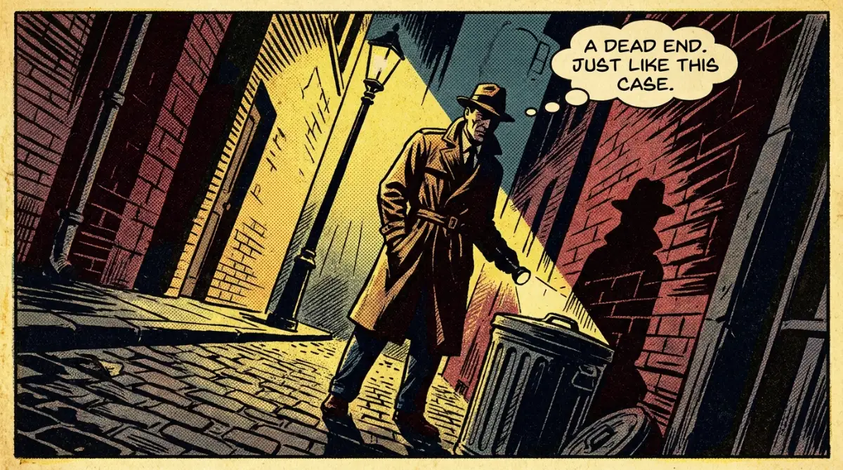
Another massive mistake is ignoring the actual camera angles and composition of your desired style. If you want something to look like a 1950s comic book, you need to understand how comic books were actually drawn. They rarely used plain, straight-on camera angles.
You need to use terms like "dynamic low angle," "dutch angle," or "extreme close-up" to match the energy of that specific era. The AI understands cinematic and photographic terminology incredibly well. By directing the virtual camera, you force the AI to frame your subject exactly like a professional artist would.
When you combine a strong medium, clear lighting, and a dynamic camera angle, your success rate skyrockets. You stop fighting with the machine and start directing it like a professional film director. This level of control brings back the joy and excitement of digital creation.
Overlooking the Power of Color Palettes
Color is one of the strongest indicators of any specific artistic movement or style. However, most people just say "make it colorful" or "make it dark," which is way too vague for a machine to understand. The AI needs strict boundaries on which colors it is allowed to pull from its database.
If you want a cyberpunk aesthetic, you cannot just rely on the word "cyberpunk" alone. You need to enforce the style by mentioning "neon magenta and cyan color palette" in your text. This forces the mathematical process to drop unwanted colors like earthy browns or natural greens.
You can even reference specific film stocks or color grading techniques used in movies. Mentioning "pastel color grading" or "muted cinematic tones" gives your image an instantly recognizable mood. Controlling the color is secretly controlling the entire emotional weight of the image.
The Danger of Ignoring Aspect Ratios
People often leave the image size exactly how they found it, usually a perfect square. But different art styles belong in different shapes and dimensions to look truly authentic. A wide, sweeping fantasy landscape simply does not look right when crammed into a tiny square box.
If you want to mimic a movie poster, you absolutely must change the dimensions to a vertical, tall format. If you want to mimic an old television cartoon, you should use a classic 4:3 aspect ratio. The shape of the canvas heavily influences how the AI decides to arrange the subjects inside it.
By changing the canvas size before you generate, you give the AI room to breathe and arrange things logically. It stops cutting off people's heads and stops cramming too many details into the center. This one tiny technical setting solves a massive amount of styling errors.
Relying Too Much on Automated Presets
Many modern tools offer easy buttons that say "Anime Style" or "Photorealistic Style" right on the dashboard. While these buttons are great for absolute beginners, they lock you inside a very generic, boring box. They apply a hidden set of words to your prompt that you cannot even see.
When you use these presets, your art will look exactly like thousands of other people's art on the internet. To truly stand out, you must turn off the training wheels and write the raw text yourself. This forces you to learn exactly which words trigger which visual reactions.
It might feel a little scary at first to build everything from scratch. However, the creative freedom you gain is absolutely worth the learning curve. You become a true director of your digital canvas, rather than just a casual consumer pushing buttons.
Pro-Level Secrets for Flawless Style Matching
Once you master the basic rules of communication, you can start using some truly powerful techniques to control your final image. I used to think the professionals just had better software than me. The reality is that they simply understand how to manipulate the mathematical weights of their words.
Think of your text prompt like a recipe for baking a cake. If you put too much flour in the bowl, the entire cake becomes dry and ruined. In the exact same way, if you put too much emphasis on the wrong word, your entire art style falls apart. You have to learn how to balance your ingredients perfectly.
The Hidden Magic of Prompt Weighting
Most standard image generators read your text from left to right, paying the most attention to the very first few words. However, you can actually force the system to care more about specific concepts by using a technique called weighting. This completely changes how the machine processes your request.
If you are trying to make a dark, moody sketch but the machine keeps adding bright colors, you need to adjust the mathematical importance of your words. By officially telling the machine that "charcoal sketch" is twice as important as "blue sky," you take back total control. This is the secret to decoding the science behind generative AI prompts without getting frustrated.
Different platforms use different symbols for this, like adding parentheses around a word or using colons with numbers. Once you learn your specific platform's weighting rules, you will never struggle with mixed-up styles again. It feels exactly like turning a volume dial up or down on specific parts of your picture.
Stealing Vocabulary from the Masters
If you truly want your digital creations to look authentic, you have to stop using computer terms and start using physical art terminology. The machine's database is filled with massive amounts of historical art knowledge. You just have to know the right passwords to unlock that specific visual history.
Instead of typing "make it look painted," you should use exact professional terms like "chiaroscuro lighting" or "impasto brushstrokes." I highly recommend spending some time reading through the official Tate Museum art terms glossary to find amazing descriptive words. When you use the actual vocabulary of traditional artists, the machine responds with incredible accuracy.
I started keeping a small notebook on my desk just to write down interesting art words I found online. Words like "gouache," "stippling," and "linocut" completely transformed the quality of my generations. You are basically teaching yourself a new artistic language, and the results are instantly visible on your screen.
The "One Variable" Testing Method
A massive habit you need to break today is changing five different words at the same time when an image fails. When you rewrite your entire prompt because the style looks slightly off, you never learn what actually caused the problem. You are basically just rolling the dice over and over again, hoping to get lucky.
The smartest creators treat their prompts like a careful science experiment. If the style is almost perfect but the texture is wrong, change only the word related to texture and hit generate again. This slow, methodical process helps you understand exactly how the machine reacts to every single word.
This careful testing is especially helpful when you are trying to master AI character consistency across multiple different art styles. When you know exactly which word controls the style and which word controls the character, you can mix and match them effortlessly. Patience is your biggest advantage in this process.
💡 My Personal Workflow Hack:
I actually keep a simple Google Sheet open while I test my prompts. I put the exact text in column A, the seed number in column B, and a quick note about what worked (or failed) in column C. It takes five extra seconds, but it saves me hours of frustration when I need to find that perfect aesthetic again a month later. You do not have to rely on your memory!
Locking Down Your Seed Numbers
Have you ever created the most beautiful, perfectly styled image, only to lose that exact look when you changed one minor detail? This happens because the AI starts with a completely random pattern of visual noise every single time you press enter. It is like shuffling a deck of cards before every single hand.
To keep your style incredibly consistent, you need to find the "seed number" of your favorite generated image. You can usually find this number hidden in the settings or image details of your software. By pasting that exact same seed number into your next prompt, you force the machine to start with the exact same deck of cards.
This one simple trick stops the system from wildly changing the art style when you make tiny text adjustments. If you want to dive deeper into how these noise patterns actually form your pictures, reading up on how stable diffusion models work will blow your mind. It completely removes the confusing mystery from the creation process.
The Hidden Traps Destroying Your Artwork
Even with the best tools and techniques, it is incredibly easy to fall into some extremely frustrating bad habits. I have wasted hundreds of hours and thousands of generation credits making the exact same silly mistakes. Let us walk through the most common traps so you can avoid that awful feeling of wasted time.
The biggest danger in this space is assuming that the machine knows better than you do. We often let the software make creative decisions for us, which leads to boring, repetitive, and ugly artwork. You have to remain the director of the project at all times.
The Disease of Prompt Copying
There are thousands of websites, forums, and social media groups dedicated to sharing massive, complicated text prompts. As a beginner, it is super tempting to just copy someone's huge paragraph, paste it into your tool, and expect a masterpiece. I used to do this every single day, and I never understood why my results always looked slightly off.
The danger here is that you are basically wearing someone else's glasses to look at your own ideas. You do not actually know what half of those copied words are doing to the image generation process. Many of those shared prompts are filled with useless junk words that actually confuse the system.
Instead of blindly copying, you should break down successful prompts and analyze why they work. Look at how they describe the lighting, the camera angle, and the specific guidelines for prompting effectively on your chosen platform. Build your own clean, simple instructions from scratch to maintain total creative control.
Ignoring the Software's Natural Bias
Every single image generator on the market has a natural, built-in preference for how things should look. If you give a very short prompt, the system will automatically fill in the blanks with its favorite aesthetic. Usually, this means making everything look like a highly polished, plastic-looking video game character.
If you are trying to mimic a messy, abstract watercolor painting, the software will naturally try to "fix" the messy parts. It wants to make the lines sharper and the colors brighter, which completely ruins your intended style. You have to actively fight against this default bias with your words.
This is exactly why you must heavily emphasize the physical medium and use strong negative prompts. You have to tell the machine, "No, I actually want this to look rough, unfinished, and human." If you do not set those boundaries, the AI will always drag your art back to that generic, boring internet style.
Freaking Out Over Minor Details Too Early
When we try to perfectly mimic a specific artist's style, we often zoom in super close to check every single pixel. We notice a slightly weird shadow or a slightly deformed object, and we immediately delete the entire prompt. This perfectionism completely destroys your creative momentum.
You need to focus on the overall mood, color, and style first, before you worry about the tiny details. If the painting looks like a beautiful Van Gogh masterpiece but the subject has a strange hand, do not throw the style away. You can easily learn how to fix deformed AI hands and faces using simple inpainting tools later.
Get the artistic aesthetic right first, and save the fixing for the very end of your workflow. Trying to achieve perfect anatomy and a perfect art style in the exact same generation is incredibly frustrating. Separate your workflow into distinct steps to save your sanity.
The Upscaling Destruction Trap
You finally get the perfect 90s anime style, and you are thrilled with the results. You immediately click the "Upscale" button to make the image bigger, but suddenly it looks completely ruined. The colors get washed out, the soft lines become harshly sharp, and all the vintage charm completely disappears.
Upscalers use completely different AI models that often do not understand the specific art style you just created. They are trained to make things look clean and realistic, which actively destroys messy or vintage aesthetics. This is exactly why your AI images look blurry or distorted after you try to make them larger.
To avoid this, you need to look for upscaling tools that let you adjust the "denoising strength" or allow you to keep the original texture. Sometimes, you just have to accept that certain vintage styles look much better at a slightly lower, softer resolution. Do not let a generic upscaler ruin your perfectly crafted aesthetic.
Forgetting the Power of Real-World Lighting
People get so obsessed with finding the perfect artist name that they completely forget how light actually works in the real world. A beautiful oil painting style will look totally flat and fake if the lighting does not make logical sense. Light is what gives an image its shape, depth, and emotional feeling.
You should always include specific lighting directions in your text, no matter what art style you are choosing. Even a flat comic book style needs to know if the scene happens during a bright noon day or a moody, rainy night. If you want to dramatically improve your results today, you must stop making these common lighting mistakes in your prompts.
When you combine a strong physical medium with beautiful, intentional lighting, your images stop looking like computer generated accidents. They start looking like intentional, deeply thoughtful pieces of art.
Chasing Trends Instead of Finding Your Voice
The internet moves incredibly fast, and there is always a new trending visual style popping up on social media every single week. It is very tempting to spend all your time trying to mimic whatever is currently popular to get likes and attention. However, this is a massive trap that keeps you acting like a copy machine instead of a real creator.
When you only mimic what everyone else is doing, your work gets lost in a massive ocean of identical images. I heavily recommend exploring resources created by real communities of AI artists who focus on pushing boundaries rather than just copying trends. Finding a unique combination of styles that you personally love is incredibly rewarding.
Try mixing strange concepts together, like "ancient Egyptian hieroglyphics mixed with 1980s neon synthwave." When you stop worrying about being perfect and start experimenting wildly, the software becomes a truly joyous tool to use.
Your Action Plan for Better Generations Tomorrow
You now hold a massive advantage over the thousands of people who just blindly type random words into their screens every day. You understand that communicating with these machines requires logic, structure, and a deep understanding of physical art terms. You do not have to settle for boring, messy, or frustrating results ever again.
Start your next session by throwing away those massive paragraphs of text you saved on your computer. Begin with just three powerful words: your main subject, the exact physical medium, and the specific lighting you want. Build your image up slowly from there, changing only one single word at a time to see how the system reacts.
Stop letting the software dictate how your imagination should look on the screen. Take back your creative control by setting strict boundaries, using negative words heavily, and organizing your thoughts clearly. The machine works for you, not the other way around.
When I finally stopped fighting the system and started speaking its true language, everything clicked into place for me. I went from feeling completely defeated by messy generations to creating exact, beautiful replicas of the ideas in my head. I know you can achieve that exact same level of creative freedom starting right now, so open up your text box and show the machine exactly who is in charge!
Common Questions About Mastering AI Aesthetics
Why does my AI art always look so plastic and fake?
This happens because the system defaults to a highly polished 3D rendering style when it lacks specific instructions. To fix this, you must explicitly mention physical mediums like "oil paint," "charcoal," or "matte paper" in your text. Using negative terms against "3D, octane render, plastic, shiny" also fixes this instantly.
Can I combine two totally different art styles in one prompt?
Yes, you absolutely can mix different aesthetics together to create something completely new. However, you must use prompt weighting to tell the system which style should be the dominant one, otherwise they will just blend into a messy blur. Try balancing the weights carefully, testing one small adjustment at a time.
Do capitalization and punctuation actually matter in AI prompts?
Capital letters generally do not change how the machine reads your words, as it converts everything to lowercase data anyway. However, punctuation like commas and periods are incredibly important for separating your ideas logically. A well-placed comma stops the machine from mixing two unrelated concepts together.
How do I make my digital art look like a real, historical painting?
You need to stop using generic words like "masterpiece" and start using the specific vocabulary of art historians. Mention the exact type of brushstrokes, the texture of the old canvas, and the fading of the specific paint colors. Adding details about cracked paint or aged varnish makes the result look incredibly authentic.
Which words help avoid the generic, boring AI look?
Avoid using highly overused internet terms like "trending on ArtStation, hyper-realistic, 8k resolution, Unreal Engine 5." These words are heavily associated with the standard, shiny AI look that everyone recognizes. Instead, replace them with terms related to film photography, traditional art supplies, and realistic studio lighting.
Disclaimer: The information provided in this article is for educational and informational purposes only. The software, tools, and platforms mentioned are subject to constant updates, and their specific features may change over time. We do not guarantee specific artistic results, and users should always respect copyright laws and the terms of service of their chosen image generation platforms.
THANK YOU