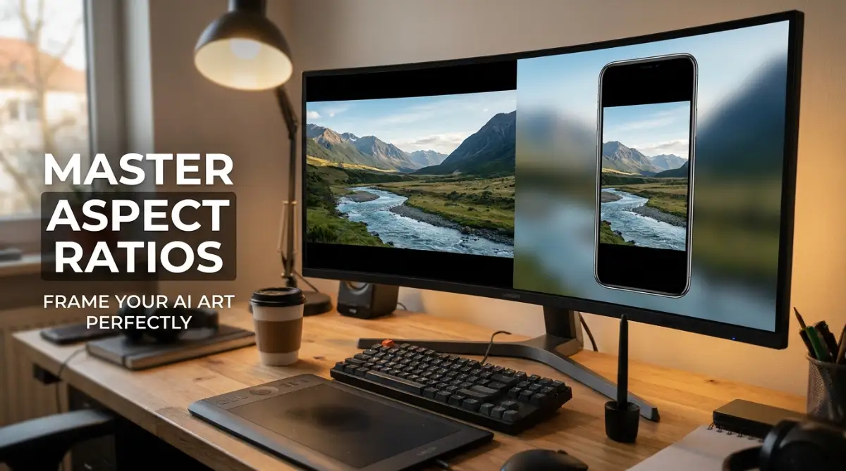
The Frustration of Badly Cropped Digital Art
You finally nailed the text prompt. The lighting is spot-on, the colors are amazing, but there is one massive problem—half of your character's head is completely missing. I used to stare at my screen wanting to throw my phone across the room when my generator spit out yet another cramped, boxy square. Let's fix that annoying cropping issue right now, so you can actually get the exact shape you want every single time.
What You Will Learn Today:
- How picking the wrong shape at the start secretly ruins your image quality.
- The exact numbers you need to type for TikTok, YouTube, and phone wallpapers.
- Why asking the AI for a wide picture actually forces it to invent extra background details.
- My personal trick to stop the AI from randomly cutting off your character's head.
Understanding the Geometry Behind Your Digital Canvas
Before we can start giving direct commands to our generation tools, we need to understand the basic math behind digital images. Do not worry, this has nothing to do with complicated school math. We simply need to look at how computer screens actually display shapes.
Think of a digital picture like a baking pan. If you pour your cake batter into a perfectly round pan, you will get a round cake. If you pour the exact same batter into a long rectangular pan, you will get a long rectangular cake.
Your text command is the batter, and the aspect ratio is the baking pan. The aspect ratio simply describes the relationship between the width and the height of your image. It tells the computer exactly what shape the final container should be before it starts drawing your picture inside of it.
The Invisible Grid That Shapes Your Art
When we talk about image sizes, we usually use two numbers separated by a colon, just like this: 16:9. The first number always represents the horizontal width of the picture. The second number always represents the vertical height.
If both numbers are exactly the same, like 1:1, that means the width and height are equal. This creates a perfect square. Almost all basic AI generators start with a 1:1 square because it is the easiest shape for the computer brain to process quickly.
However, we do not live in a square world. Our televisions are wide, our phones are tall, and our printed photos are usually slightly rectangular. If you want your artwork to look professional, you must force the AI to step outside of its comfortable square box.
The Most Common Shapes You Will Ever Need
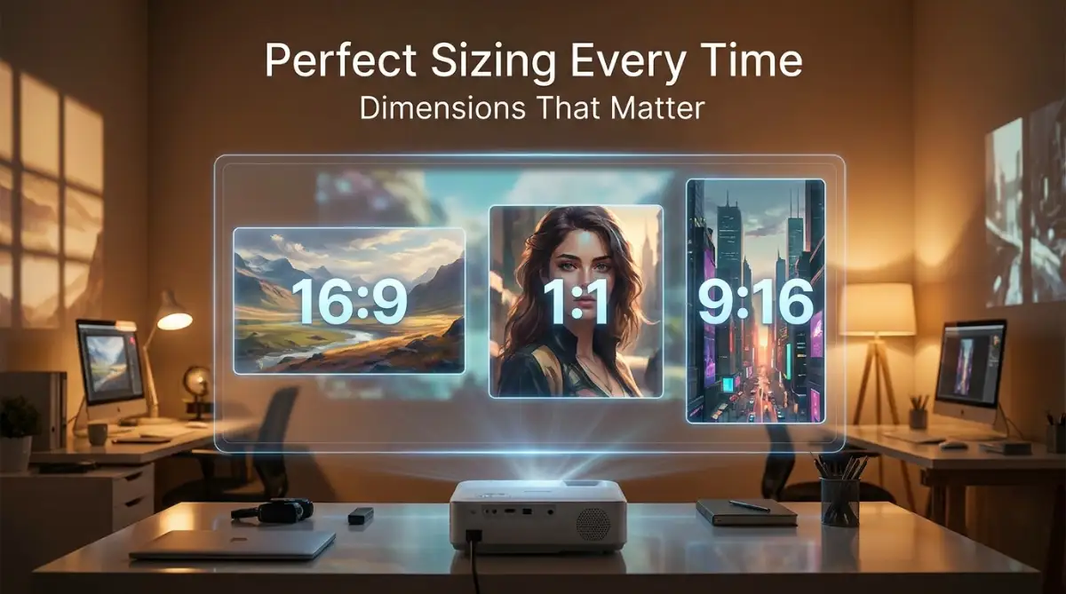
To make things incredibly easy, you only really need to memorize three primary shapes. Once you understand these three common ratios, you can create perfectly sized art for almost any situation.
The first essential shape is 16:9, which is a wide rectangle. Look at your flat-screen television or your laptop monitor right now. They are almost certainly built in a 16:9 shape, which makes it the absolute best choice for epic cinematic shots and computer wallpapers.
The second most popular shape is 9:16, which is the exact opposite. This is a tall, vertical rectangle. Whenever you hold your smartphone completely straight up and down, you are looking at a 9:16 screen.
The third standard shape is 4:3, which is a slightly wider rectangle but not as extreme as a modern TV. This is the classic shape of old televisions and standard digital cameras. It is a fantastic, balanced shape for simple portraits and standard website images.
AI Aspect Ratio: Myth vs. Fact
**If you want to see exactly how different screen shapes completely change the mood of a picture, you have to watch this incredible visual breakdown.**
How Canvas Shape Changes the AI Brain
Here is a fascinating scientific fact about how generative models actually work. When you change the aspect ratio, you are not just stretching or cutting the picture. You are completely changing how the artificial intelligence thinks about your prompt.
Let us say you write a prompt asking for "a lonely cabin in the snowy woods." If you ask for a square shape, the AI will likely put the cabin right in the dead center. It will surround the cabin with just a few trees to fill the small space evenly.
But what happens if you ask for that same cabin in an extremely wide 16:9 format? The AI brain suddenly realizes it has massive empty spaces on the left and right sides of the cabin. To fill this new empty space, it will start inventing extra details that you did not even ask for!
The Magic of Wide Compositions
When given a wide canvas, the AI will start generating beautiful rolling hills, distant mountains, or extra snowy trees on the edges. It understands that a wide picture needs more environmental storytelling. The model stretches its imagination horizontally to make the entire scene feel grand and impressive.
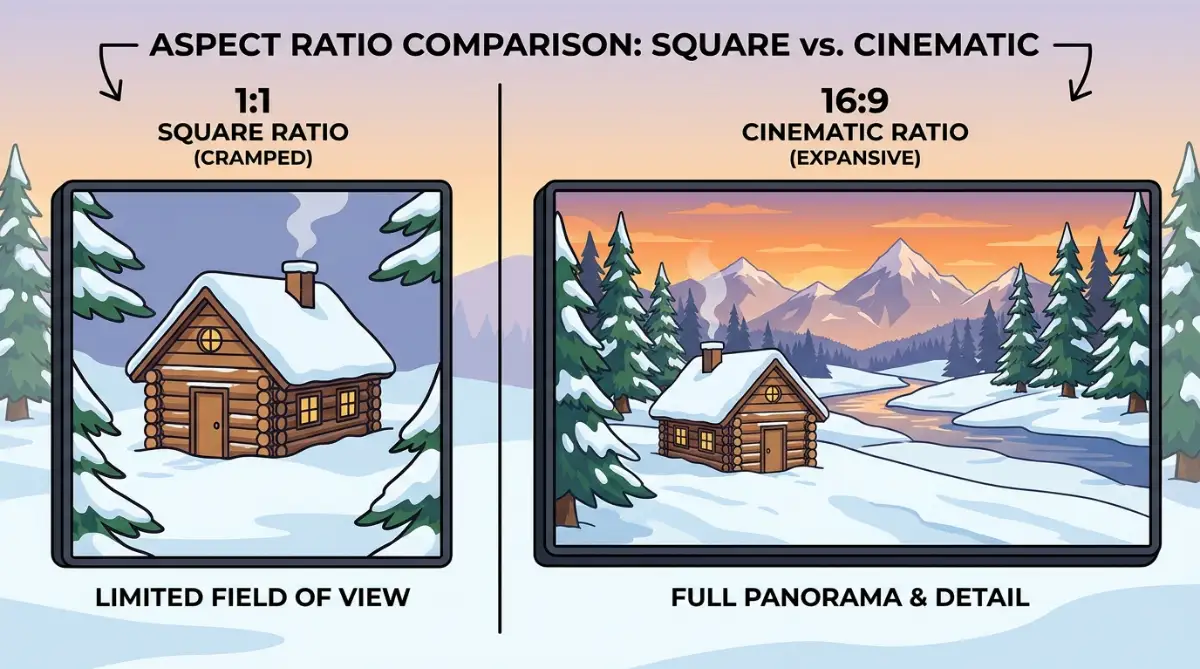
This is why wide aspect ratios are absolutely perfect for world-building and nature scenes. They give the software enough breathing room to show off complex backgrounds. If you try to cram a massive city skyline into a tiny square, the buildings will look totally squished and confusing.
The Power of Vertical Focus
Now, imagine asking for that same snowy cabin in a tall 9:16 vertical format. The AI now has very little room on the left and right, but massive empty space at the top and bottom. How does it handle this new vertical challenge?
Instead of drawing distant mountains, the AI will likely draw a very tall, detailed pine tree next to the cabin. It might draw a highly detailed snowy path leading up to the front door at the bottom of the picture. It might even spend extra processing power drawing dramatic, swirling clouds high up in the sky to fill the top space.
Vertical ratios force the AI to focus on tall objects and deep foreground details. This makes vertical shapes the absolute best choice for full-body human portraits, tall fantasy towers, and fashion photography. The software naturally understands that vertical space requires vertical subjects.
My Personal Growth and Realization
I used to generate everything as a basic square and just crop it on my phone later to save time. I quickly realized this completely ruined the resolution of my artwork, making everything look like a blurry, pixelated mess. Once I started commanding the AI to generate the exact shape I needed from the very beginning, my art instantly looked ten times more professional.
The Danger of Cropping After Generating
You might be wondering why you cannot just take a wide picture and cut the sides off later. Let me explain why this is a terrible idea for your digital art. When an AI generates a picture, it calculates the perfect lighting, framing, and composition for that specific bounding box.
If you take a wide cinematic shot and slice off the left and right sides to make it fit on a phone, you destroy the artistic balance. The subject might suddenly look too big, or the lighting source might get cut out of the frame. You lose all the beautiful context that made the image special in the first place.
Furthermore, when you cut away pieces of an image, you are literally throwing away valuable pixels. A picture that looked crisp and sharp in its original wide format will look surprisingly soft and low-quality when zoomed in. This is why you must always plan your final shape before you ever hit the enter key.
Formats for Specific Social Media Platforms
To truly master your digital creations, you need to know exactly what the internet wants. Different social media platforms strongly prefer different shapes. If you give a platform the wrong shape, their automated systems might limit your reach. To stay updated on these constant changes, I always recommend checking a reliable, up-to-date social media image size guide before you start generating.
Instagram used to only allow perfect squares (1:1). While they still accept squares, the algorithm now highly favors portrait images in a 4:5 ratio. This specific shape is slightly taller than a square, taking up more space on the user's phone screen while they scroll.
If you are creating artwork specifically for Pinterest, you absolutely must use tall vertical shapes. Pinterest recommends a 2:3 ratio for all of its standard pins. A wide image on Pinterest will look incredibly tiny, and users will simply scroll right past your hard work.
YouTube thumbnails require a perfect 16:9 wide format. If you generate a square image for your YouTube video cover, the website will add ugly black bars on the sides. Knowing these exact platform requirements saves you hours of frustration and makes your art look incredibly professional online.
Quick Social Media Size Guide
Overcoming AI Stubbornness with Ratios
Sometimes, you will ask the AI for a very specific shape, and it will struggle to understand the contents of your prompt. For example, if you ask for a "wide panoramic view of a long train" but force the AI to use a tall vertical aspect ratio, the software will get deeply confused.
The software knows a train is long, but you are forcing it to draw in a tall, narrow box. When this happens, the AI often hallucinates terrible mistakes. It might draw a train standing straight up in the air, or it might just draw the front headlight of the train completely zoomed in.
You have to match the subject matter to the mathematical shape. If your subject is naturally wide, you must give the software a wide canvas. If your subject is naturally tall, like a standing human or a skyscraper, you must provide a vertical canvas.
Understanding this relationship between your text prompt and the mathematical shape of the canvas is the true secret to becoming an expert creator. You are no longer just rolling the dice and hoping for a good picture. You are taking complete control over the invisible grid that builds your imagination.
Taking Total Command of Your Visual Frame
I used to think that picking a size was just a small detail at the end of my creative process. I would write a long, beautiful prompt and then just hope the AI knew what I wanted. But I soon learned that if you don't tell the machine exactly how to build the "box" for your art, it will make poor choices for you.
One of my favorite secrets is matching the movement of your subject to the shape of your canvas. If I am generating a soaring eagle or a falling waterfall, I always choose a very tall vertical frame. This forces the AI to focus on the downward or upward energy of the scene.
If I choose a wide horizontal frame for a tall waterfall, the AI often gets confused and adds weird, unnecessary mountains on the sides. This dilutes the power of the main subject. I realized that decoding generative AI is more about understanding these spatial rules than just picking pretty words.
Composing for the Cinematic Experience
When you want your art to feel like a big-budget movie, you have to use the wide-angle approach. I found that using a 21:9 or 2:1 ratio creates a "letterbox" effect that our eyes naturally link to cinema. It makes the world feel huge and expensive.
I suggest using this wide frame for any art that involves big groups of people or vast cities. It gives the AI room to breathe and add small background details that make the world feel alive. If you try to put a whole army in a square box, the soldiers look like tiny ants.
When I work on these wide scenes, I also pay close attention to the edges. Sometimes the AI puts strange objects at the very edge of a wide frame. I learned that keeping your main focus slightly off-center makes the wide shot look more professional and less like a cheap snapshot.
Vertical Framing for Personal Connection
Vertical frames aren't just for phone screens; they are for intimacy. When I want to create a deep emotional connection with a character, I choose a tall frame. This cuts out the busy background and forces the viewer to look directly into the eyes of the subject.
This is also a great way to master AI character consistency because you are limiting what the AI has to draw. By focusing only on the character's face and upper body, the AI makes fewer mistakes with the clothing or the hands.
I often use a 4:5 or 9:16 ratio for these character-driven pieces. It feels like a real magazine cover or a professional headshot. My biggest realization was that the frame acts like a director's lens, telling the viewer exactly where to look.
The Science of Human Vision and Sizing
Scientists and artists who study visual composition have found that our eyes prefer horizontal views for exploring. Horizontal lines promote a feeling of calm and stability, while vertical lines feel more active and powerful. I use this knowledge every time I start a new project. If I want a peaceful beach scene, I go wide. If I want a powerful hero standing tall, I go vertical.
On the other hand, vertical lines feel more active and powerful. I use this knowledge every time I start a new project. If I want a peaceful beach scene, I go wide. If I want a powerful hero standing tall, I go vertical.
This isn't just a guess; it is how our brains are wired to process the world. When you use the right ratio, you are literally speaking to the viewer's brain in a language it already understands. You are making your art feel "right" without them even knowing why.
Consistency Across Your Portfolio
If you are building a brand or a specific project, you must keep your sizes the same. I once made the mistake of mixing square, wide, and tall images in a single presentation. It looked messy and unprofessional.
I now pick one "master ratio" for a specific project and stick to it. If I am making a set of character cards, they all stay in a 2:3 ratio. If I am making a digital comic, every panel follows a specific grid.
This habit helps you stay organized and makes your work look like it came from a high-end studio. It also helps with technical issues later on. You won't have to spend hours resizing images to make them fit together in a gallery or on a webpage.
Quick Fixes for Common Aspect Ratio Disasters
The Hidden Sins of Bad Aspect Ratio Management
I have seen so many beautiful pieces of art get ruined because the creator ignored the basic rules of framing. It is painful to see a stunning landscape that looks stretched out like a piece of chewed bubble gum. These mistakes happen because people treat the frame as an afterthought instead of the foundation.
The Stretching and Squishing Nightmare
The most common crime is forcing an image into a shape it was never meant to be. If you generate a beautiful square image and then try to stretch it into a wide banner, everyone will know. The trees look too fat, and the people look like they have been flattened by a heavy weight.
This mistake screams "beginner" to anyone who looks at your work. It also creates a massive technical problem. Stretching an image ruins the pixel quality and is a main reason why your AI images look blurry.
I felt so embarrassed when I did this early on. I thought I could just "fix it later" in a photo editor. But once the AI builds the image in one shape, you can't just pull the corners to make it another shape without losing the soul of the art.
The Disaster of the "Cropped Head"
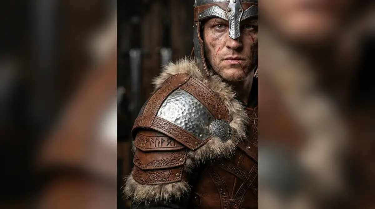
Another emotional blow is when you get the perfect face but the AI cuts off the top of the head. This usually happens because you used a horizontal frame for a vertical subject. The AI tries to fit a tall human into a wide box, and the only way it can do that is by zooming in too much.
I have lost so many good generations because I picked the wrong ratio at the start. It is incredibly frustrating to see a perfect facial expression but realize the hair and the chin are missing. You can't just "un-crop" an image that was never there.
This is why learning how to fix deformed AI hands and faces is so important, but preventing the bad crop is even better. You save so much time when you just pick the right box from the very first second.
Forgetting the "Safe Zones" for Social Media
If you plan to post your art on apps like Instagram or TikTok, you have to be very careful. These apps put buttons and text overlays on top of your image. If you put your main subject at the very bottom or top, the app's UI will cover your hard work.
I once made a stunning poster with a hidden message at the bottom. When I posted it, the "like" and "comment" buttons covered the message completely. I felt like I had wasted all that effort because I didn't think about where the buttons would go.
Professional designers follow standards like the Google Material Design guidelines to make sure their content stays visible. You should do the same with your AI art. Keep your main focus in the center of the frame so it stays safe no matter where you post it.
The Resolution vs Ratio Trap
A huge mistake is thinking that ratio and resolution are the same thing. They are not. You can have a 16:9 image that is very small and low-quality, or a 16:9 image that is huge and crisp.
If you pick a wide ratio but don't increase the resolution settings, your wide shot will look pixelated. The AI has to stretch its "brain" over a larger area, and if you don't give it enough pixels, it will struggle.
I always check my final pixel count before I finish a project. It is the only way to ensure my work looks good on a 4K monitor. If you ignore this, you might end up with lighting mistakes you must avoid becoming even more obvious because the image is so grainy.
Building a Professional Visual Future
Mastering the shape of your canvas is the final step in becoming a true AI artist. It moves you away from just "playing" with a tool and toward actually "creating" a masterpiece. You are no longer a passenger in the AI's car; you are the driver who decides where the road goes.
I want you to stop accepting the default square settings. Every time you start a new prompt, ask yourself: "What is the best shape for this story?" If it is a mountain, go tall or wide. If it is a person, go vertical.
By making this one small change, you will see your art transform immediately. You will find that your compositions look more balanced, your subjects look more powerful, and your followers will start to notice the professional quality. The power to control the frame is the power to control the viewer's emotions.
My Personal Action Plan for You: I truly believe that once you start seeing the world in ratios, you can never go back. I want you to go to your favorite AI tool right now and generate the same prompt three times using three different shapes. See for yourself how the AI changes the background and the lighting to fit the new boxes. This little experiment will teach you more than any book ever could, so go out there and start framing your dreams today!
Common Questions About Aspect Ratio
How do I actually change the ratio in tools like Midjourney or DALL-E?
It depends entirely on the tool you use. If you are using Midjourney, you simply type --ar 16:9 (or whatever numbers you want) at the very end of your text prompt. If you are using DALL-E 3 inside ChatGPT, you do not need weird codes. You just talk to it like a friend and say, "Please make this a wide horizontal image." Always check your specific tool's help page for the exact commands.
Which aspect ratio is best for high-quality printing?
For standard photo prints, a 2:3 or 4:6 ratio is usually the best choice. If you want to print a large poster, you should check with your local print shop first, but 18x24 inches (3:4 ratio) is a very popular size for digital art.
Does changing the ratio cost more credits in AI tools?
In most AI tools, changing the shape of the image does not cost extra credits. However, some tools might take a few seconds longer to generate a very wide or very tall image because the computer has to calculate more details for the extra space.
Can I change the ratio after the image is already generated?
Most basic tools don't let you change the ratio after the fact without cropping. However, advanced tools now have a feature called "Outpainting" that lets you add more detail to the sides of an existing image to change its shape without stretching it.
Why does my AI art look weird when I use extreme ratios like 21:1?
Extreme ratios are very hard for the AI to understand because most of the images it was trained on are standard shapes. If you go too wide or too tall, the AI might start repeating the same pattern over and over again to fill the space, which looks very unnatural.
What is the best size for a YouTube thumbnail?
YouTube thumbnails must be in a 16:9 ratio. The ideal resolution is 1280x720 pixels. If you use any other shape, YouTube will add black bars or cut off the edges of your art, which makes it look less clickable.
Disclaimer: The information provided in this article is for educational purposes only. AI art tools and social media platform requirements change frequently. We are not responsible for any loss of credits, data, or image quality that may occur when using third-party software. Always save a backup of your original generations before attempting to crop or resize them for professional use. We do not promote any specific AI tool and encourage you to read the terms of service for any generator you use.
THANK YOU