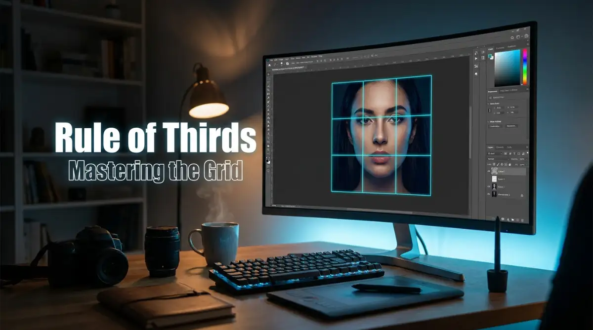
Why My Early Photos Always Felt Completely Unbalanced
Ever look at a photo you just took and think, "Why does this look so flat?" I used to stare at my screen for hours, dragging filters left and right, hoping to fix my dull photos. But the truth is, no amount of color grading can save a badly framed shot. I finally figured out that the real fix happens when you just move your subject a few inches away from the center. Let me show you exactly how shifting your focus can completely change the vibe of your pictures.
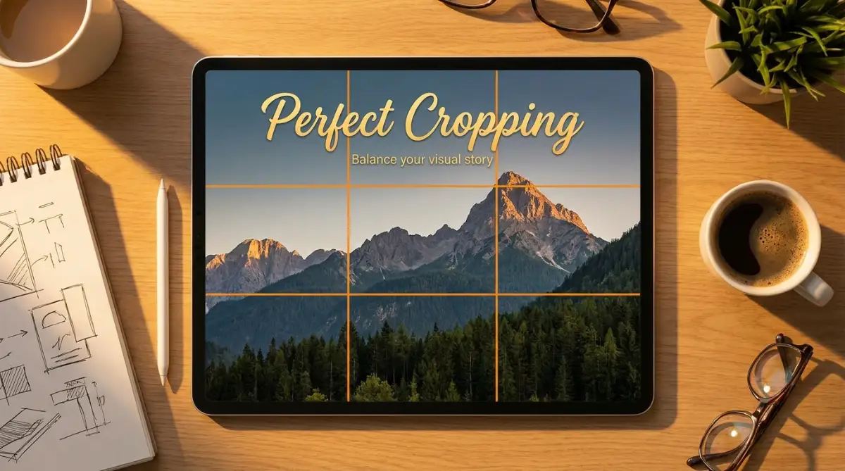
Quick Takeaways for Better Framing:
- Stop centering everything: Placing your subject in the exact middle makes the photo look like a rigid ID card.
- Use the 3x3 grid: Turn on your software's grid tool and put your main subjects on the points where the lines cross.
- Give your subjects room to breathe: If someone is looking or running to the right, leave empty space on the right side of the photo.
- Embrace negative space: Empty areas in your photo are just as important as the actual subject; they stop your image from feeling cluttered.
The Hidden Geometry of a Perfect Frame
You do not have to throw away your messy shots or rush out to buy new gear. As highlighted by professional resources on the Nikon Learn and Explore Hub, most of the real magic happens in post-production when you start framing with intention.
By using a very specific framing technique during the post-production stage, you can save almost any messy picture. The secret lies in understanding how the human eye naturally scans a digital screen.
Our brains do not actually like looking right at the center of a picture for too long. We prefer to wander around the image and explore the surrounding details.
When you force a viewer to stare at the exact middle of your photo, you remove all the natural movement from the story. This makes the viewing experience feel incredibly rigid and unnatural.
To fix this, professional editors rely on a simple geometric guide. This guide helps them arrange digital elements in a way that feels organic and deeply satisfying.
If you want to dive deeper into official industry standards, exploring resource hubs like the Adobe Photography Discover Hub is a great way to see how pros define these geometric rules.
Understanding the 3x3 Grid System
Imagine drawing two evenly spaced horizontal lines across your computer screen. Now, draw two evenly spaced vertical lines intersecting them.
You have just created a simple grid with nine equal squares. This basic grid is the foundation of the most famous composition technique in visual arts.
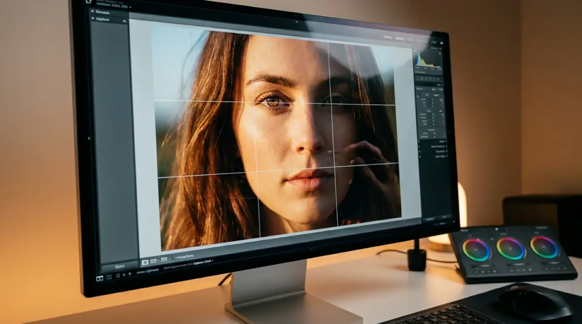
The four spots where these lines cross each other are known as intersection points. These specific points are massive magnets for human attention.
When someone looks at your edited photo, their eyes will automatically jump to one of these four intersections first. They will rarely look at the dead center unless they are forced to do so.
Finding the Power Points in Your Software
Almost every modern editing program has this grid built right into its core features. You do not have to guess where these magical lines are located.
When you open your cropping tool, this nine-square overlay usually appears automatically. If it does not show up, you can easily turn it on in the view settings of your software.
Seeing this grid is your first step toward fixing a boring visual composition. It acts as a visual map, showing you exactly where the most important parts of your story belong.
Why Off-Center Placement Works So Well
Placing your main subject on one of these intersecting lines creates a wonderful sense of tension and energy. The image suddenly feels like it has a distinct direction and purpose.
If you place a person on the right vertical line, you instantly open up the left side of your frame. This empty space gives your subject room to breathe and look natural.
It makes the viewer feel like they are standing right there, observing a real moment unfold. Center-placement often feels like an ID card photo, while off-center placement feels like a cinematic movie scene.
Practical Cropping Techniques for Visual Harmony
Knowing about the grid is great, but actively using it to rescue a bad photo is where the real fun begins. You can completely change the mood of a picture just by pulling the edges of your crop box.
Let us explore exactly how you can manipulate your existing photos to achieve perfect visual balance. You can apply these simple steps to everything from family portraits to wide outdoor shots.
See How the Pros Frame Their Shots in Real-Time
Sometimes reading about grids can feel a bit abstract, so seeing a visual demonstration can make the concept instantly click. Watch this incredibly helpful breakdown to see exactly how editors shift their frames.
Step 1: Rescuing Awkward Portraits
Portraits are usually the hardest photos to get right during the actual shoot. People move quickly, and you often end up with way too much empty sky above their heads.
When you open this kind of photo in your editor, your first goal is to locate the eyes. The human eye is the most important element of any portrait.
I used to crop my photos way too tight, thinking I needed to fill the entire screen with my subject. I quickly learned that leaving some empty space on the opposite side of my grid actually makes the picture breathe. My edits instantly improved when I started treating negative space as an active subject itself.
Drag your cropping tool until the person's eyes rest beautifully on the top horizontal line. Even better, try to place their dominant eye right on one of the top intersection points.
This simple adjustment immediately connects the viewer to the person in the photo. It removes all the unnecessary ceiling or sky, focusing the entire story directly on the human emotion.
Quick Smartphone Tip: You actually do not need editing software to practice this. Grab your phone right now. If you use an iPhone, go to Settings > Camera > toggle on "Grid". For Android, open the Camera app, tap the gear icon, and turn on "Grid lines". Now you can frame those eyes perfectly before you even take the shot!
Step 2: Fixing Tilted Outdoor Shots
We all have photos of beautiful oceans or fields where the horizon line is completely crooked. A slanted background makes the viewer feel dizzy and confused.
Open your crop tool and look closely at the two horizontal lines in your grid. You must decide whether the ground or the sky is the most interesting part of your story.
If the sky has amazing, dramatic clouds, place the ground along the bottom horizontal line. This gives the sky two-thirds of the image, making it feel massive and powerful.
If the ground is full of beautiful flowers, pull the horizon up to the top horizontal line. This simple choice creates a clear visual hierarchy and immediately fixes the confusing tilt.
Step 3: Managing the Direction of Movement
When you are editing a picture of someone walking, running, or driving, the direction they are facing matters heavily. You must respect their implied path of motion.
If a runner is moving toward the right side of the screen, do not place them on the right vertical line. If you do this, they will look like they are about to crash into the edge of your photo.
Instead, crop the image so the runner is positioned on the left vertical line. This leaves two-thirds of the picture empty in front of them.

This open space visually represents the journey they are taking. It makes the digital image feel highly dynamic and full of active storytelling.
Dynamic Content Block: Myth vs Reality
When you start learning about visual grids, you will hear a lot of confusing advice online. Let us clear up some common misunderstandings so you can edit with total confidence.
- The Big Myth: You must apply this exact grid to every single photo you ever edit, or the photo is technically wrong.
- The Simple Reality: This grid is just a helpful guideline, not a strict legal requirement. If your photo has perfect symmetry, like a reflection in a calm lake, centering your subject is actually the better choice.
- The Big Myth: You need expensive, professional software to use this technique effectively.
- The Simple Reality: Even the most basic, free photo apps on your smartphone feature this exact cropping grid. You just need to look for the tiny square icon in your tools menu.
Balancing Heavy Elements in Your Edits
Sometimes you will have a photo with one very large subject and a few smaller background details. If you just guess where to place things, the picture will feel completely lopsided.
Imagine a heavy weight sitting on one side of a seesaw. To balance it, you need something on the other side.
In digital editing, we use the grid intersections to manage this exact type of visual weight. If your main subject is huge and sits on the left power points, the right side might feel completely empty.
You can fix this by carefully cropping the image so a smaller background element lands near the right power points. This diagonal relationship creates a wonderful sense of stability.
The Magic of Negative Space
Empty areas in your photos are just as important as the actual subjects. This emptiness is commonly called negative space.
When you move a subject off-center using your software grid, you naturally create a large pocket of negative space. Do not be afraid of this emptiness.
This blank area helps highlight your main subject by removing distracting clutter. It gives the viewer's brain a quiet place to rest before looking back at the main focal point.
When you learn to love negative space, your edits will instantly look much cleaner and highly professional. You will stop feeling the urge to zoom in constantly.
Trimming Away Distractions
One of the greatest benefits of using an editing grid is discovering what you actually need to delete. When you are forcing your subject onto a specific intersection, other things will naturally get pushed out of the frame.
This is actually a fantastic thing for your visual story. You might notice half a car, a random trash can, or a distracting sign sitting on the edge of your original photo.
By firmly pulling your crop lines inward to match the grid, these annoying distractions disappear completely. The grid forces you to make strong, deliberate choices about what truly matters in your picture.
Reframing Video Clips with the Same Logic
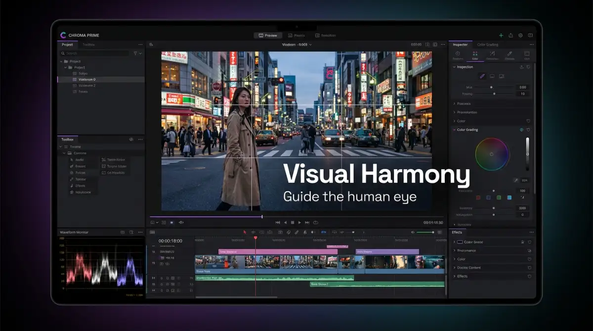
This powerful concept is not just for static pictures. If you edit videos, this exact same geometric rule applies to moving subjects.
When you are cutting together an interview, you never want the person talking from the dead center of the screen. It feels way too much like a news broadcast.
Instead, use your video editor's safe margin grids to shift the speaker to the left or right third. If they are looking slightly toward the right, position their body on the left vertical line.
This framing technique makes digital videos feel much more cinematic and conversational. Viewers will stay engaged longer because the framing feels highly natural to their eyes.
Keyframes and Digital Panning
Sometimes you receive video footage where the camera operator completely ignored the grid. The subject is awkwardly trapped in the middle of a wide shot.
Because most modern cameras shoot in very high resolutions, you have plenty of room to fix this digitally. You can literally zoom into the footage on your editing timeline.
Once you are zoomed in slightly, simply slide the footage left or right until the person hits a grid intersection. You have effectively saved a bad shot by creating a completely new frame in post-production.
This simple digital slide completely changes the professional quality of your final exported video. It shows that you have total control over the visual narrative.
Leveling Up Your Edits: Beyond the Basic Grid
Once you understand how the basic 3x3 grid works, you are ready to unlock some truly amazing editing secrets. Beginners simply place their subject on a line and call it a day. Experts know that the grid is actually a living, breathing map that connects different parts of your story.
You can completely change how a viewer feels just by manipulating multiple points on this map at the same time. Let us explore some powerful techniques that will make your daily edits look incredibly professional.
These are the exact same methods used by high-end graphic designers and professional digital artists. Once you start practicing these habits, you will naturally build a very strong eye for visual harmony.
Connecting Leading Lines to the Power Points
One of my absolute favorite tricks involves mixing the grid with natural lines found inside the photo. Think about a picture of a long road, a river, or even a tall fence.
These natural lines automatically pull the viewer’s eye deep into the background. You can make this effect ten times stronger by forcing those lines to point directly at a grid intersection.
Imagine you are editing a picture of a walking trail through a forest. If you crop the photo so the end of the trail lands exactly on the bottom-right intersection, the result is magical.
The human brain loves this kind of visual direction. Research on eye-tracking and visual attention shows that our eyes naturally follow strong paths before resting on a specific target. By combining natural lines with your editing grid, you give the viewer a highly satisfying visual journey.
Managing Heavy Colors Across the Frame
Visual balance is not just about physical objects; it is also heavily affected by bright colors. A very bright, saturated color feels extremely heavy to the human eye.
If you have a bright red car on the left side of your photo, the left side suddenly feels very heavy. If you leave the right side completely empty and gray, the whole picture feels like it is falling over.
You can fix this easily by using the opposite power points on your grid. When you crop your image, try to position the bright red car on a left intersection, and look for another pop of color to place on a right intersection.
This creates a wonderful diagonal balance that makes the photo feel stable. This is especially helpful if you are trying to avoid bad lighting habits that ruin your digital art, as bright highlights also act like heavy visual weights.
The Foreground and Background Dance
Another amazing way to use your editing grid is by separating your layers of depth. A truly great photo usually has something interesting in the front and something beautiful in the back.
You can use the top and bottom intersections to separate these two layers perfectly. Place your lovely background element, like a mountain peak, on a top power point.
Then, place your foreground element, like a pretty rock or a flower, on the opposite bottom power point. This pushes the two subjects apart, creating a massive sense of 3D space.
Your viewers will feel like they can physically step right into the computer screen. This method is taught in almost every respected professional photography composition guide because it consistently produces stunning results.
Developing a Long-Term Editor's Eye
You might wonder how you can keep doing this without getting exhausted. The secret is to stop relying on the visual grid overlay over time.
When you first start, you absolutely need to turn the grid on in your software. But as you practice, you should try to imagine the lines before you even open the crop tool.
Make it a fun daily habit to analyze posters, movie scenes, and magazine covers. Try to guess where the hidden intersections are hiding in their designs.
Eventually, this geometry will become entirely second nature to you. You will be able to easily maintain a uniform creative style across all your projects without overthinking the math.
The Traps That Will Ruin Your Visual Story
Even with a magical grid guiding your way, it is incredibly easy to destroy a perfectly good photo. I have ruined hundreds of amazing memories simply because I did not know when to stop adjusting the frame.
When we learn a new trick, our natural instinct is to force it onto every single thing we create. This often leads to highly unnatural, awkward edits that make the viewer feel very uncomfortable.
Let us look closely at the worst traps you will face when adjusting your digital frames. Avoiding these specific habits will save you hours of unnecessary frustration.
The Nightmare of the Claustrophobic Crop
This is easily the most common mistake I see new creators make. They get so obsessed with putting an eye or a face on an intersection point that they zoom in way too close.
When you push the edges of the frame right up against someone’s head, they look trapped inside a tiny box. The picture loses all its environmental context and suddenly feels very anxious.
This extreme cropping often forces you to slice off natural joints, like elbows or ears, which looks highly disturbing. If you constantly struggle with awkwardly deformed body parts in your digital creations, poor cropping choices are usually to blame.
Always remember to leave enough empty room for your subject to exist peacefully. Your grid should organize the space, not completely suffocate it.
Destroying Natural Symmetry
Sometimes, nature gives you a perfectly balanced, symmetrical scene. Think about a beautiful building with a door right in the middle, or a perfectly round flower.
When a picture has stunning natural symmetry, the absolute worst thing you can do is apply an off-center grid. If you force a symmetrical subject to the left or right, it immediately looks like a mistake.
The human brain actually loves pure symmetry just as much as it loves off-center balance. According to extensive resources from the American Psychological Association, the human brain naturally finds perfect symmetry highly appealing because it visually signals health, order, and calm.
You have to trust your own gut feeling when you open a new picture. If the image already feels incredibly powerful right in the dead center, turn the grid off and leave it alone.
Ignoring Your Resolution Limits
Here is a very painful reality about digital editing that nobody likes to admit. You cannot crop a photo infinitely without paying a massive price in quality.
If you shoot a very wide picture and then crop 80 percent of it away just to reach a grid point, your final image will look terrible. The picture will lose all its sharp details and become a pixelated, fuzzy mess.
You might have perfectly aligned the subject, but the overall presentation will look entirely amateur. This is a huge reason why digital images suddenly look blurry and awful after they are saved and exported.
If fixing the composition requires you to destroy the image quality, the crop is simply not worth it. You must find a gentle middle ground between good geometry and maintaining high-resolution clarity.
Forcing a Story That Does Not Exist
Another huge trap is trying to use the grid to fix a picture that has no clear subject. The grid is a magnifying glass for your main story.
If you take a messy picture of a dirty room with fifty random items, aligning one coffee cup to an intersection point will not save the photo. The viewer will still feel completely overwhelmed by the background clutter.
You must decide what your true subject is before you even touch the crop handles. If you do not know what the picture is actually about, your software cannot magically figure it out for you.
When you thoughtfully structure your digital inputs and ideas before editing, the grid simply acts as the final polish. The grid enhances a good story, but it cannot create one from nothing.
Your Next Steps to Beautiful Visual Stories
You now hold the exact same blueprint that top editors use to create stunning, engaging content every single day. You understand how the hidden geometry of a simple grid can totally transform a boring, flat image into a highly dynamic story.
By actively deciding where to place your main subjects, you are finally taking true control over your digital art. You are no longer just guessing and hoping that the final export looks acceptable.
You know exactly how to manage negative space, how to balance heavy colors, and how to guide your viewer's eyes. More importantly, you know exactly when to break these rules to protect the natural beauty of perfect symmetry.
Your journey toward better visual presentation starts the moment you open your next photo. Simply turn on that tiny 3x3 overlay in your software and let it reveal the hidden potential inside your camera roll.
If you are looking for more premium digital tools and creative assets to upgrade your workspace, building this foundational editing skill will make all those tools work ten times better. The gear does not make the artist; the artist's eye makes the gear shine.
I honestly wish someone had explained this simple geometry to me when I first started editing my dark, messy photos. My biggest piece of advice to you is to open an old, boring photo right now, turn on your crop grid, and just play around with the edges. You will be absolutely amazed by the beautiful, professional story hiding right there in front of you.
Questions Creators Always Ask About Framing
Do I have to use this framing rule for every single picture?
Not at all. This technique is simply a very helpful tool to create visual interest when your picture feels flat or boring. If your photo has natural symmetry or a very powerful central subject, centering it is actually the best choice.
Can I combine this editing grid with other composition tricks?
Yes, combining techniques creates the absolute best results. You can easily align your subject on a grid intersection while using natural background lines to point directly at them.
What if my main subject is too big for a single intersection point?
If your subject is very large, like a full-body portrait, simply align their most important feature with the grid. For humans and animals, always try to place their eyes near the top intersection points to create a strong emotional connection.
Does this geometry work for square social media posts?
Yes, the math works perfectly no matter what shape your final image is. Even inside a perfect square, moving your subject slightly off-center will make the post look far more professional and engaging to scrolling viewers.
How do I fix a photo if I already cropped it too tight?
If you already saved over the original file, it is very hard to recover lost edge details. You can sometimes use advanced AI generative fill tools to rebuild the missing background, giving you more space to try a better crop.
About the Author:
I have spent years wrestling with digital frames, editing software, and content creation. My goal is to break down complex photography rules into simple, bite-sized habits anyone can use. When I am not fixing crooked horizons, I am exploring the best ways to make digital storytelling feel natural and human.
Disclaimer: The tips and techniques shared in this article are for educational and informational purposes only. Every editing software interface may vary slightly. Please always ensure you keep a backup of your original photos before making permanent cropping or editing changes.